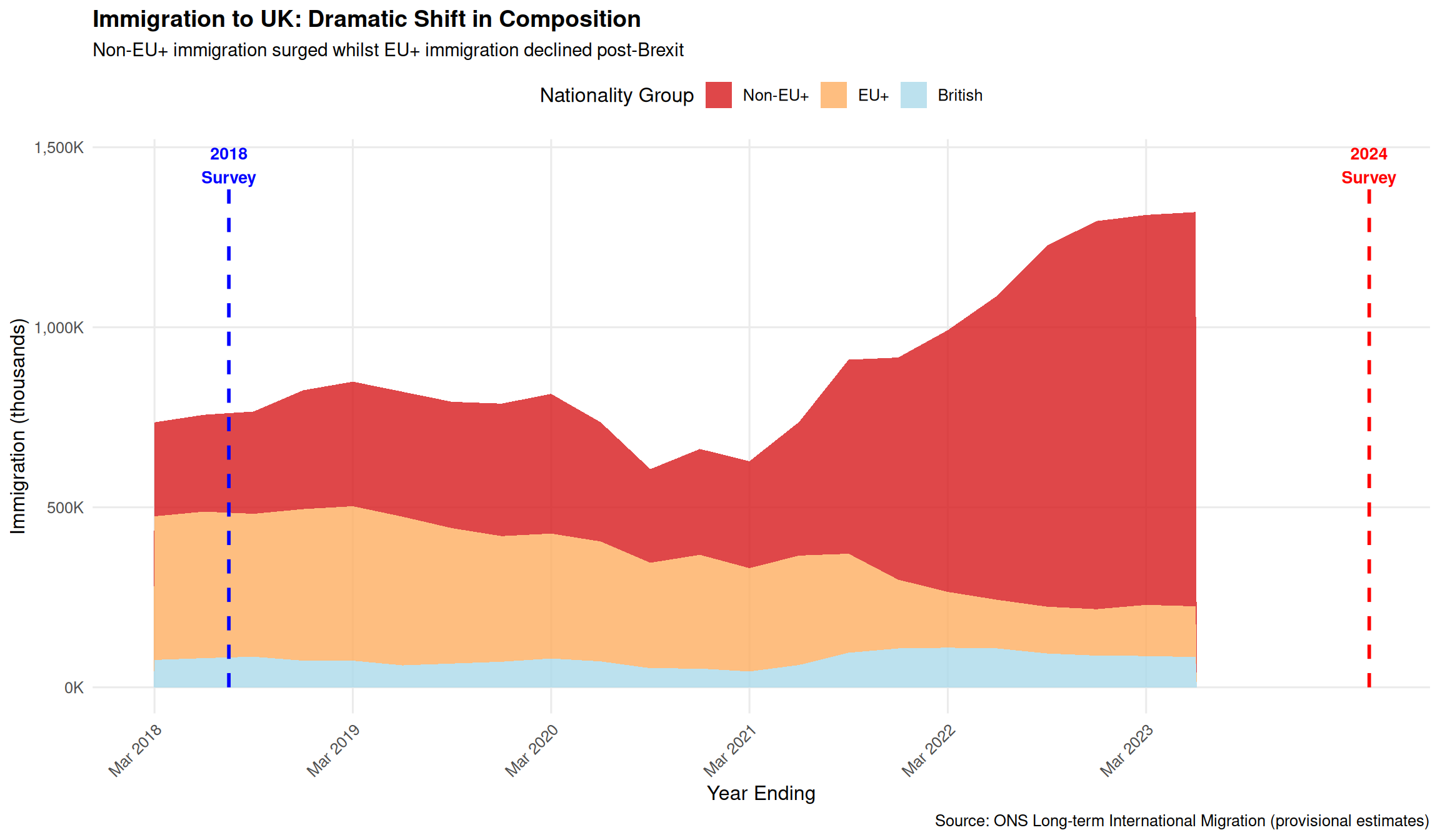
# Filter net migration data
net_migration <- migration_period %>%
filter(flow == "Net migration") %>%
arrange(year, match(quarter, c("Mar", "Jun", "Sep", "Dec"))) %>%
mutate(
period_label = paste0(quarter, " ", year),
period_order = row_number()
)
# Create time series plot
ggplot(net_migration, aes(x = period_order)) +
# Total net migration
geom_line(aes(y = all_nationalities / 1000, color = "Total"),
linewidth = 1.5, alpha = 0.9) +
geom_point(aes(y = all_nationalities / 1000, color = "Total"),
size = 3) +
# Non-EU+ (main driver)
geom_line(aes(y = non_eu_plus / 1000, color = "Non-EU+"),
linewidth = 1.2, alpha = 0.9) +
geom_point(aes(y = non_eu_plus / 1000, color = "Non-EU+"),
size = 2.5) +
# EU+
geom_line(aes(y = eu_plus / 1000, color = "EU+"),
linewidth = 1.2, alpha = 0.9) +
geom_point(aes(y = eu_plus / 1000, color = "EU+"),
size = 2.5) +
# British
geom_line(aes(y = british / 1000, color = "British"),
linewidth = 1.2, alpha = 0.9) +
geom_point(aes(y = british / 1000, color = "British"),
size = 2.5) +
# Survey periods
annotate("rect", xmin = 0.5, xmax = 4.5, ymin = -200, ymax = 1000,
alpha = 0.1, fill = "blue") +
annotate("text", x = 2.5, y = 950, label = "2018 Survey\nPeriod",
size = 3.5, fontface = "bold", color = "blue") +
annotate("rect", xmin = 23.5, xmax = 27.5, ymin = -200, ymax = 1000,
alpha = 0.1, fill = "red") +
annotate("text", x = 25.5, y = 950, label = "2024 Survey\nPeriod",
size = 3.5, fontface = "bold", color = "red") +
# Zero line
geom_hline(yintercept = 0, linetype = "dashed", color = "grey50") +
scale_color_manual(
values = c("Total" = "#2c7bb6", "Non-EU+" = "#d7191c",
"EU+" = "#fdae61", "British" = "#abd9e9"),
name = "Nationality Group"
) +
scale_x_continuous(
breaks = seq(1, nrow(net_migration), by = 4),
labels = net_migration$period_label[seq(1, nrow(net_migration), by = 4)]
) +
scale_y_continuous(labels = comma_format(suffix = "K")) +
labs(
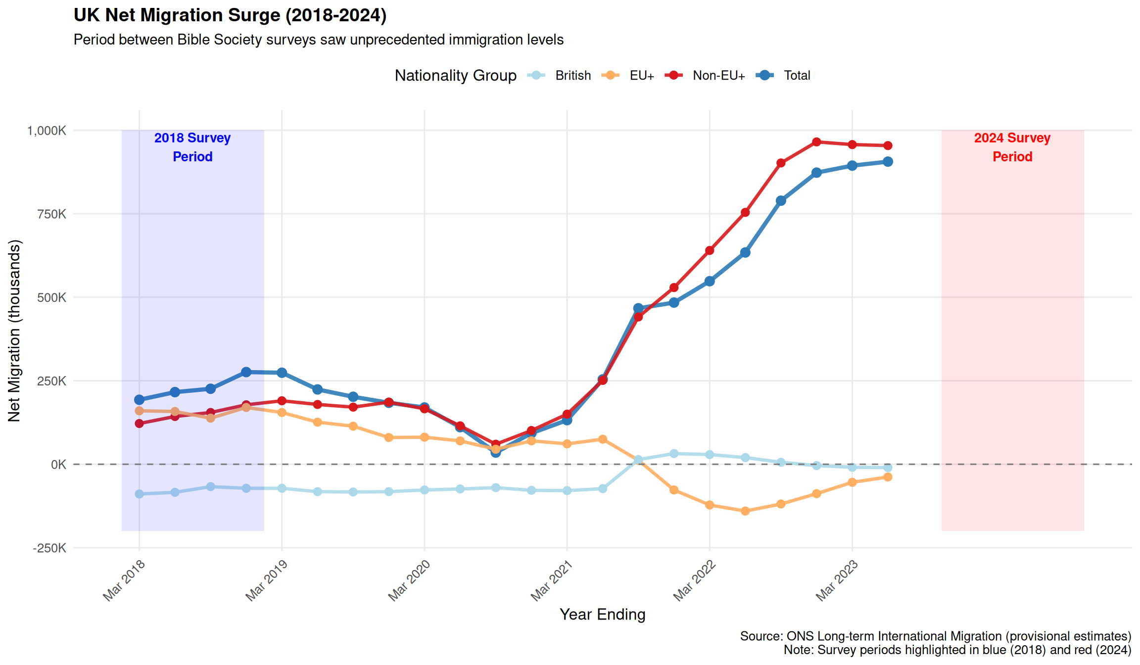
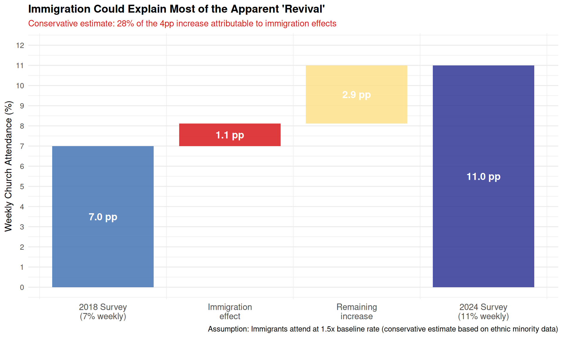
title = "UK Net Migration Surge (2018-2024)",
subtitle = "Period between Bible Society surveys saw unprecedented immigration levels",
x = "Year Ending",
y = "Net Migration (thousands)",
caption = "Source: ONS Long-term International Migration (provisional estimates)\nNote: Survey periods highlighted in blue (2018) and red (2024)"
) +
theme_minimal(base_size = 12) +
theme(
plot.title = element_text(face = "bold", size = 14),
plot.subtitle = element_text(size = 11),
legend.position = "top",
axis.text.x = element_text(angle = 45, hjust = 1),
panel.grid.minor = element_blank()
)