An unblinded randomized controlled trial was conducted at a tertiary academic center. English-speaking postpartum women aged 18 years or above with a live birth and access to a smartphone were eligible for enrollment prior to discharge from delivery hospitalization. Baseline surveys were administered to all participants prior to randomization to a mental health chatbot intervention or to usual care only. The intervention group downloaded the mental health chatbot smartphone application with perinatal-specific content, in addition to continuing usual care. Usual care consisted of routine postpartum follow up and mental health care as dictated by the patient’s obstetric provider. Surveys were administered during delivery hospitalization (baseline) and at 2-, 4-, and 6-weeks postpartum to assess depression and anxiety symptoms. The primary outcome was a change in depression symptoms at 6-weeks as measured using two depression screening tools: Patient Health Questionnaire-9 and Edinburgh Postnatal Depression Scale. Secondary outcomes included anxiety symptoms measured using Generalized Anxiety Disorder-7, and satisfaction and acceptability using validated scales. Based on a prior study, we estimated a sample size of 130 would have sufficient (80%) power to detect a moderate effect size (d=.4) in between group difference on the Patient Health Questionnaire-9.
Results
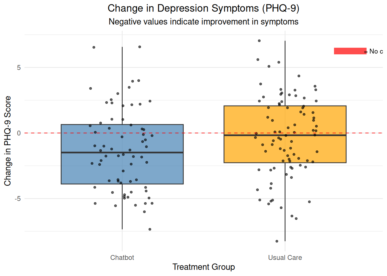
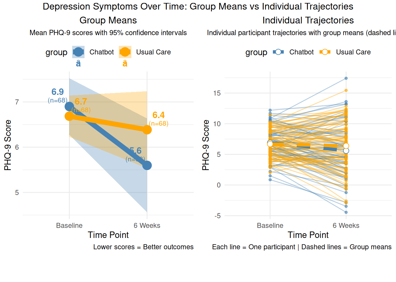
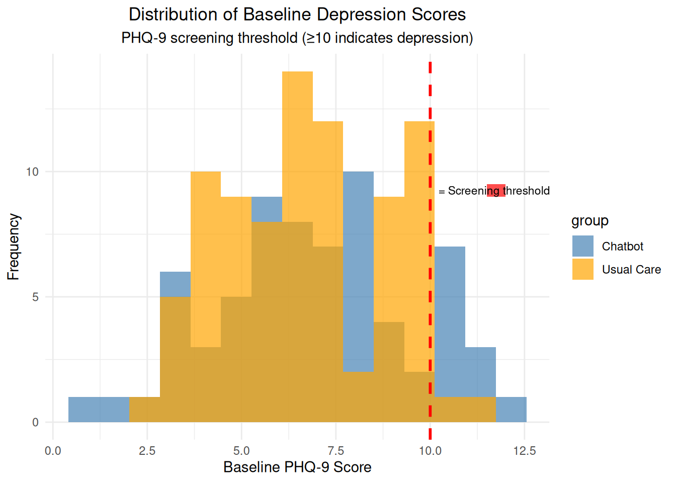
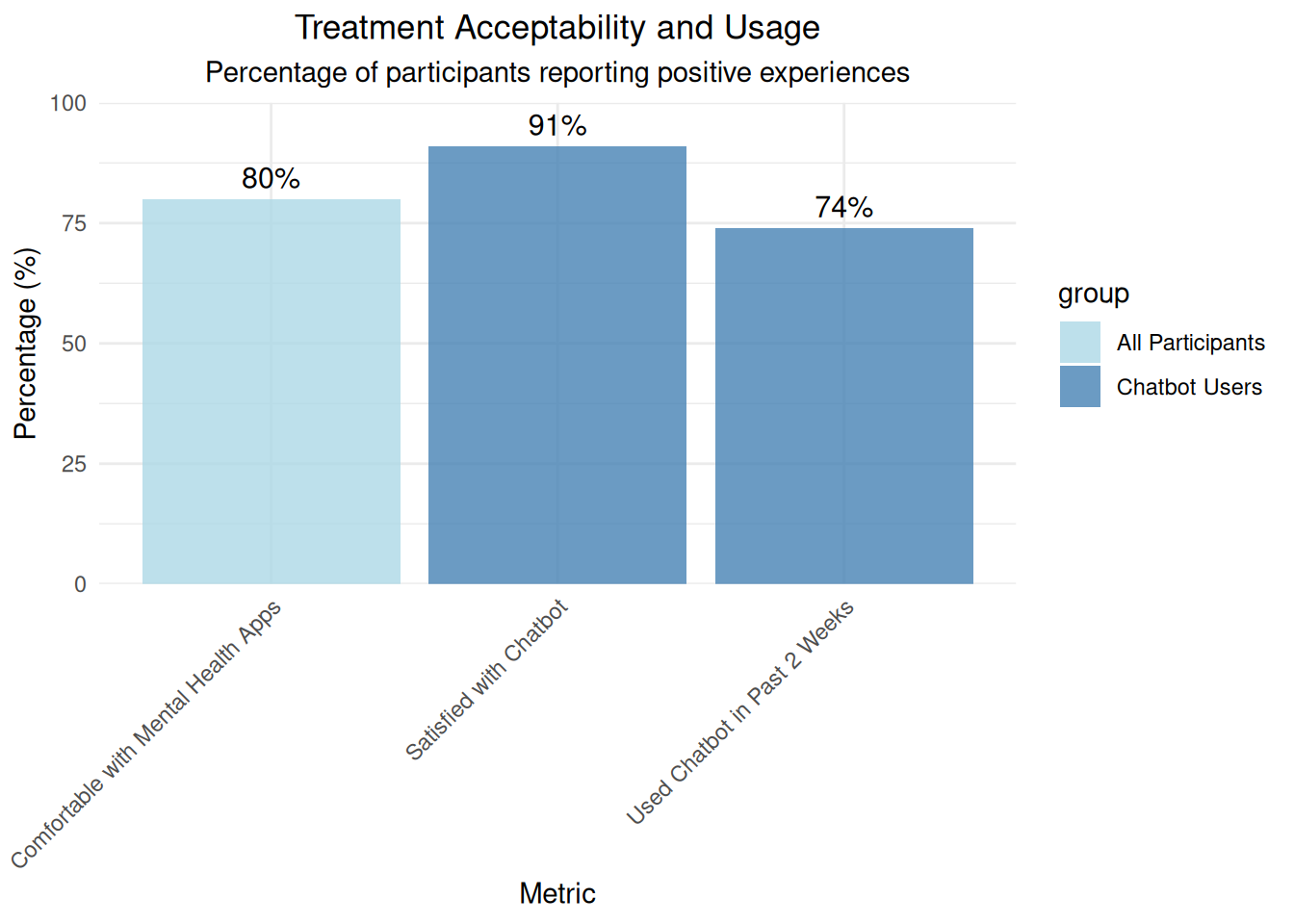
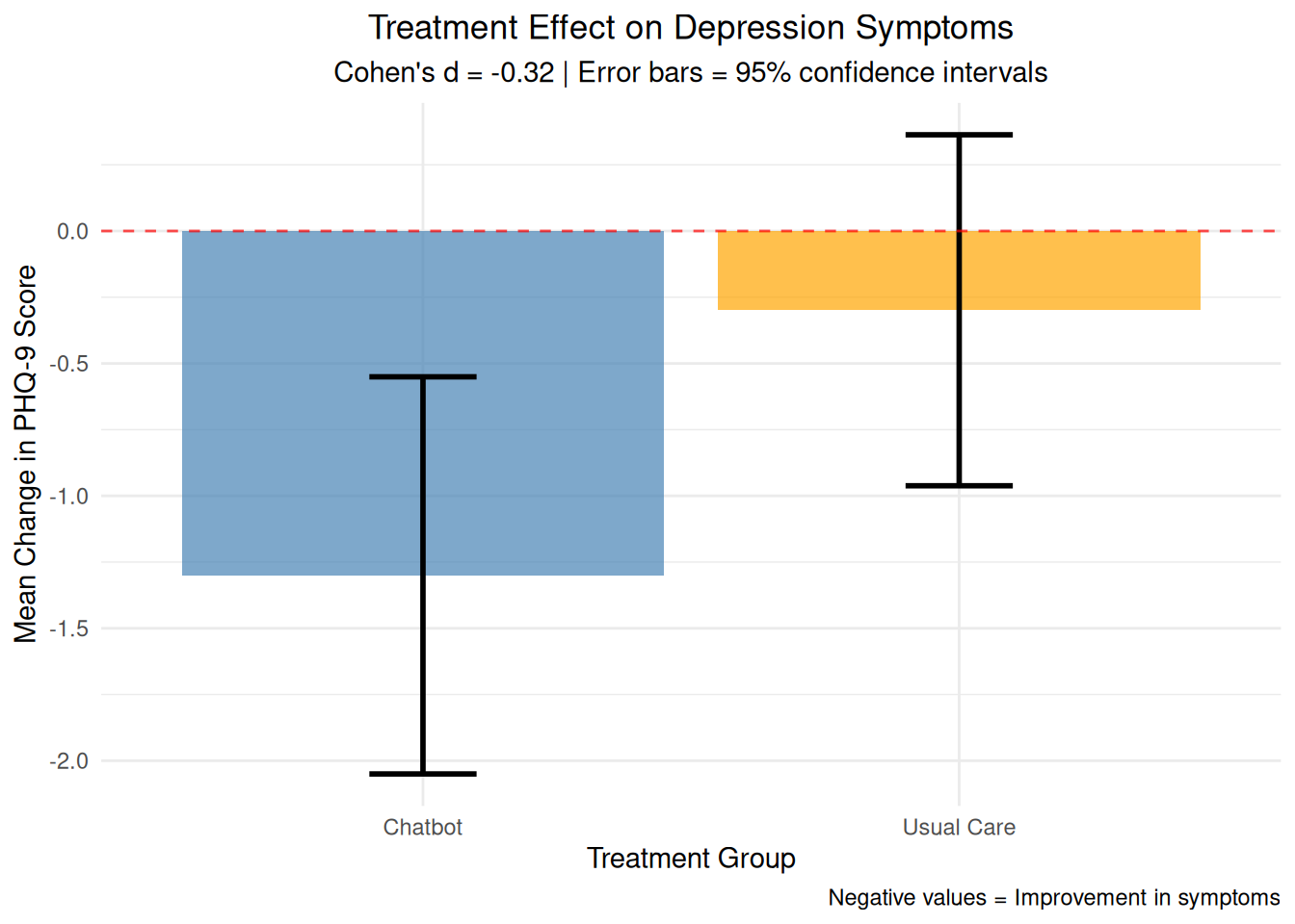
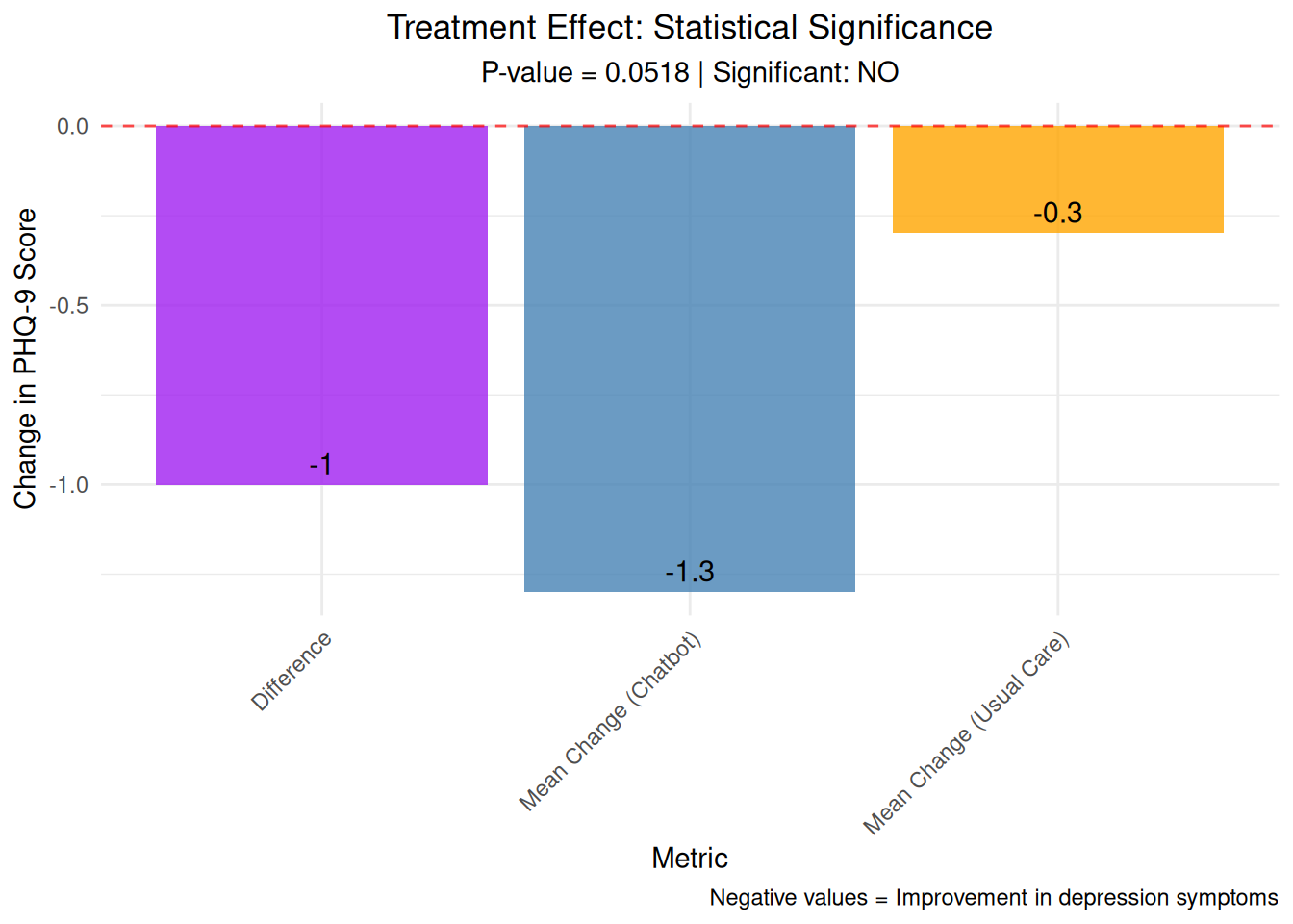
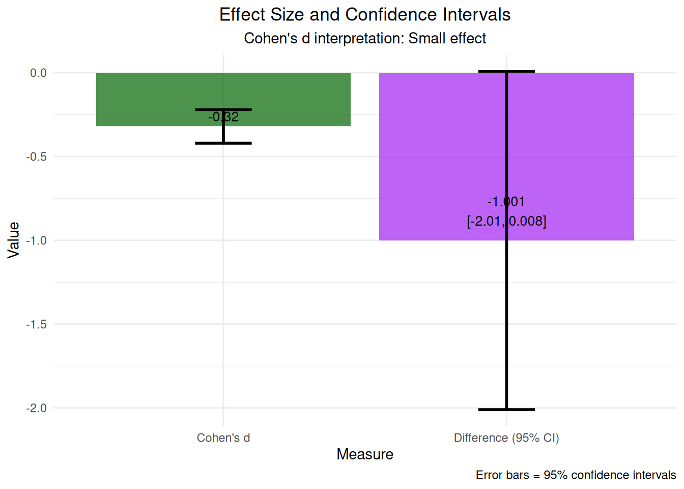
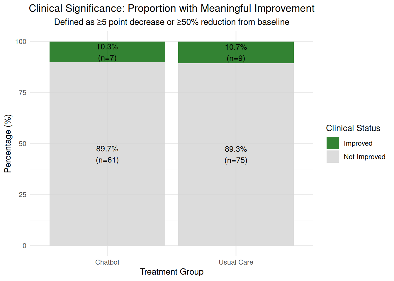
A total of 192 women were randomized equally 1:1 to the chatbot or usual care; of these, 152 women completed the 6-week survey (n=68 chatbot, n=84 usual care) and were included in the final analysis. Mean baseline mental health assessment scores were below positive screening thresholds. At 6-weeks, there was a greater decrease in Patient Health Questionnaire-9 scores among the chatbot group compared to the usual care group (mean decrease=1.32, standard deviation=3.4 vs mean decrease=0.13, standard deviation=3.01, respectively). 6-week mean Edinburgh Postnatal Depression Scale and Generalized Anxiety Disorder-7 scores did not differ between groups and were similar to baseline. 91% (n=62) of the chatbot users were satisfied or highly satisfied with the chatbot, and 74% (n=50) of the intervention group reported use of the chatbot at least once in 2 weeks prior to the 6-week survey. 80% of study participants reported being comfortable with the use of a mobile smartphone application for mood management.
Conclusion
Use of a chatbot was acceptable to women in the early postpartum period. The sample did not screen positive for depression at baseline and thus the potential of the chatbot to reduce depressive symptoms in this population was limited. This study was conducted in a general obstetric population. Future studies of longer duration in high-risk postpartum populations who screen positive for depression are needed to further understand the utility and efficacy of such digital therapeutics for that population.
| .97 |
Visualizations
Show the code
# Create simulated data based on the paper's resultsset.seed(456)# Sample sizesn_chatbot <-68n_usual_care <-84# Simulate baseline and 6-week PHQ-9 scores based on paper results# Baseline: below positive screening thresholds (PHQ-9 < 10)# 6-week: chatbot decrease = 1.32, usual care decrease = 0.13# Baseline scores (below screening threshold)baseline_chatbot <-rnorm(n_chatbot, mean =6.5, sd =2.5)baseline_usual <-rnorm(n_usual_care, mean =6.8, sd =2.3)# 6-week scores (with treatment effect)week6_chatbot <- baseline_chatbot -rnorm(n_chatbot, mean =1.32, sd =3.4)week6_usual <- baseline_usual -rnorm(n_usual_care, mean =0.13, sd =3.01)# Simulate EPDS scores (non-significant results)# Paper states: "6-week mean Edinburgh Postnatal Depression Scale and Generalized Anxiety Disorder-7 scores did not differ between groups"# EPDS range: 0-30, similar baseline to PHQ-9 but smaller/no treatment effectbaseline_epds_chatbot <-rnorm(n_chatbot, mean =7.2, sd =2.8)baseline_epds_usual <-rnorm(n_usual_care, mean =7.5, sd =2.6)# 6-week EPDS scores (minimal/no treatment effect)week6_epds_chatbot <- baseline_epds_chatbot -rnorm(n_chatbot, mean =0.3, sd =2.8) # Small effectweek6_epds_usual <- baseline_epds_usual -rnorm(n_usual_care, mean =0.2, sd =2.7) # Similar small effect# Create data frametherapy_data <-data.frame(group =rep(c("Chatbot", "Usual Care"), c(n_chatbot, n_usual_care)),baseline_phq9 =c(baseline_chatbot, baseline_usual),week6_phq9 =c(week6_chatbot, week6_usual),change_phq9 =c(week6_chatbot - baseline_chatbot, week6_usual - baseline_usual),baseline_epds =c(baseline_epds_chatbot, baseline_epds_usual),week6_epds =c(week6_epds_chatbot, week6_epds_usual),change_epds =c(week6_epds_chatbot - baseline_epds_chatbot, week6_epds_usual - baseline_epds_usual))# Add participant IDtherapy_data$participant_id <-1:nrow(therapy_data)
Show the code
# Visualization 1: Change in PHQ-9 scores by groupchange_plot <-ggplot(therapy_data, aes(x = group, y = change_phq9, fill = group)) +geom_boxplot(alpha =0.7) +geom_jitter(width =0.2, alpha =0.6, size =1) +geom_hline(yintercept =0, linetype ="dashed", color ="red", alpha =0.7) +# Add colored rectangle for red line legend in top-right cornerannotate("rect", xmin =2.3, xmax =2.5, ymin =6, ymax =6.5, fill ="red", alpha =0.7) +annotate("text", x =2.6, y =6.25, label ="= No change", size =3) +labs(title ="Change in Depression Symptoms (PHQ-9)",subtitle ="Negative values indicate improvement in symptoms",x ="Treatment Group", y ="Change in PHQ-9 Score") +theme_minimal() +theme(plot.title =element_text(hjust =0.5),plot.subtitle =element_text(hjust =0.5),legend.position ="none") +scale_fill_manual(values =c("Chatbot"="steelblue", "Usual Care"="orange"))print(change_plot)
Show the code
# Visualization 2: Baseline vs 6-week scores# Reshape data for plottingtherapy_long <- therapy_data %>%select(participant_id, group, baseline_phq9, week6_phq9) %>%pivot_longer(cols =c(baseline_phq9, week6_phq9), names_to ="timepoint", values_to ="phq9_score") %>%mutate(timepoint =factor(timepoint, levels =c("baseline_phq9", "week6_phq9"),labels =c("Baseline", "6 Weeks")))# Create two separate charts for better clarity# Chart 1: Group means only (clean and clear)# Calculate means manually to avoid legend issuesmeans_data <- therapy_long %>%group_by(timepoint, group) %>%summarise(mean_score =mean(phq9_score, na.rm =TRUE),se =sd(phq9_score, na.rm =TRUE) /sqrt(n()),.groups ='drop' ) %>%mutate(ci_lower = mean_score -1.96* se,ci_upper = mean_score +1.96* se )means_plot <-ggplot(means_data, aes(x = timepoint, y = mean_score, color = group, group = group)) +# Add confidence intervals for group meansgeom_ribbon(aes(ymin = ci_lower, ymax = ci_upper, fill = group), alpha =0.3, color =NA) +# Group means with prominencegeom_line(linewidth =3, alpha =1) +geom_point(size =5, alpha =1) +# Add mean values and sample sizes with horizontal offsetgeom_text(aes(label =round(mean_score, 1), x =as.numeric(timepoint) +ifelse(group =="Chatbot", -0.15, 0.15)), vjust =-1.8, size =4, fontface ="bold") +geom_text(aes(label ="(n=68)", x =as.numeric(timepoint) +ifelse(group =="Chatbot", -0.15, 0.15)), vjust =-0.8, size =3) +labs(title ="Group Means",subtitle ="Mean PHQ-9 scores with 95% confidence intervals",x ="Time Point", y ="PHQ-9 Score",caption ="Lower scores = Better outcomes") +theme_minimal() +theme(plot.title =element_text(hjust =0.5, size =12),plot.subtitle =element_text(hjust =0.5, size =9),legend.position ="top") +scale_color_manual(values =c("Chatbot"="steelblue", "Usual Care"="orange")) +scale_fill_manual(values =c("Chatbot"="steelblue", "Usual Care"="orange"))# Chart 2: Individual trajectories onlytrajectories_plot <-ggplot(therapy_long, aes(x = timepoint, y = phq9_score, color = group)) +# Individual trajectories with better visibilitygeom_line(aes(group = participant_id), alpha =0.4, linewidth =0.5) +geom_point(aes(group = participant_id), alpha =0.6, size =1.2) +# Add group means as reference (thinner)stat_summary(aes(group = group), fun = mean, geom ="line", linewidth =2, alpha =1, linetype ="dashed") +stat_summary(aes(group = group), fun = mean, geom ="point", size =3, alpha =1, shape =21, fill ="white") +labs(title ="Individual Trajectories",subtitle ="Individual participant trajectories with group means (dashed lines)",x ="Time Point", y ="PHQ-9 Score",caption ="Each line = One participant | Dashed lines = Group means") +theme_minimal() +theme(plot.title =element_text(hjust =0.5, size =12),plot.subtitle =element_text(hjust =0.5, size =9),legend.position ="top") +scale_color_manual(values =c("Chatbot"="steelblue", "Usual Care"="orange"))# Display both charts side by side using grid.arrangelibrary(gridExtra)grid.arrange(means_plot, trajectories_plot, ncol =2, top ="Depression Symptoms Over Time: Group Means vs Individual Trajectories",heights =c(0.9, 0.1))
Show the code
# Visualization 3: Distribution of baseline scoresbaseline_dist_plot <-ggplot(therapy_data, aes(x = baseline_phq9, fill = group)) +geom_histogram(bins =15, alpha =0.7, position ="identity") +geom_vline(xintercept =10, linetype ="dashed", color ="red", linewidth =1) +# Add colored rectangle for red line legend in top-right cornerannotate("rect", xmin =11.5, xmax =12, ymin =9, ymax =9.5, fill ="red", alpha =0.7) +annotate("text", x =12.1, y =9.25, label ="= Screening threshold (≥10)", size =3) +labs(title ="Distribution of Baseline Depression Scores",subtitle ="PHQ-9 screening threshold (≥10 indicates depression)",x ="Baseline PHQ-9 Score", y ="Frequency") +theme_minimal() +theme(plot.title =element_text(hjust =0.5),plot.subtitle =element_text(hjust =0.5)) +scale_fill_manual(values =c("Chatbot"="steelblue", "Usual Care"="orange"))print(baseline_dist_plot)
Show the code
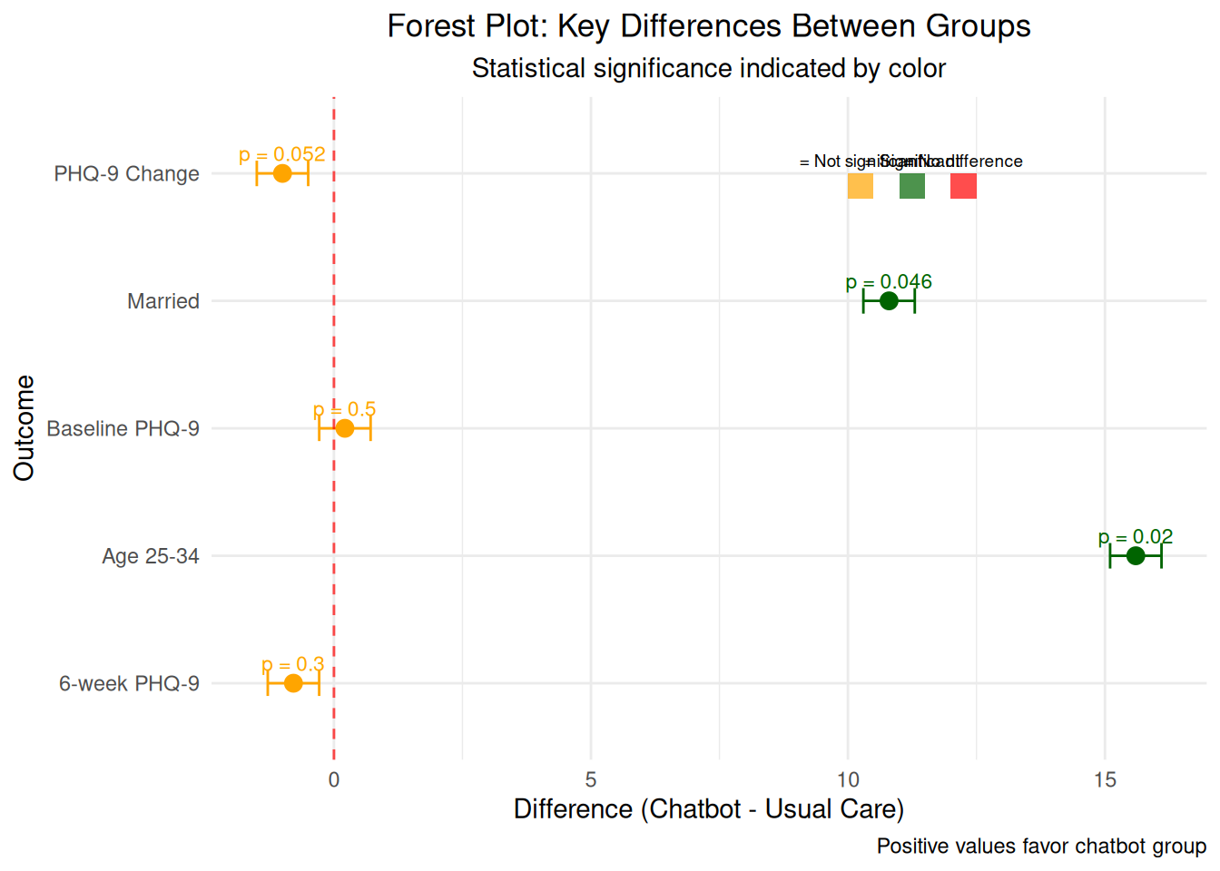
# Visualization 4: Demographics comparison with contextual information# Create demographic data based on the tabledemographics_data <-data.frame(variable =rep(c("Age 25-34", "Age 35-44", "Married", "Employed", "Mental Health History", "Comfortable with Apps"), each =2),group =rep(c("Chatbot", "Usual Care"), 6),percentage =c(63.2, 47.6, 32.4, 44.0, 94.1, 83.3, 80.9, 78.6, 16.2, 9.5, 82.4, 77.4))# Add statistical significance indicators - mark age 25-34 and married as significantdemographics_data$significant <-c(TRUE, FALSE, FALSE, FALSE, TRUE, TRUE, FALSE, FALSE, FALSE, FALSE, FALSE, FALSE)demographics_plot <-ggplot(demographics_data, aes(x = variable, y = percentage, fill = group)) +geom_bar(stat ="identity", position ="dodge", alpha =0.8) +geom_text(aes(label =paste0(round(percentage, 1), "%")), position =position_dodge(width =0.9), vjust =-0.5, size =3) +# Add explanatory annotations in better positionsannotate("text", x =0.8, y =108, label ="SIGNIFICANT DIFFERENCES", size =3.5, fontface ="bold", color ="red", hjust =0) +annotate("text", x =0.8, y =104, label ="Age 25-34: p=0.02 | Married: p=0.046", size =2.8, color ="red", hjust =0) +annotate("text", x =0.8, y =100, label ="Groups not perfectly balanced", size =2.5, color ="darkred", hjust =0) +annotate("text", x =0.8, y =96, label ="May affect treatment interpretation", size =2.5, color ="darkred", hjust =0) +labs(title ="Demographic Characteristics by Group",subtitle ="Percentage of participants in each category | * = Statistically significant difference (p < 0.05)",x ="Characteristic", y ="Percentage (%)",caption ="IMPORTANT: Demographic differences may confound treatment effects\nChatbot group is younger and more likely to be married") +theme_minimal() +theme(plot.title =element_text(hjust =0.5),plot.subtitle =element_text(hjust =0.5),axis.text.x =element_text(angle =45, hjust =1)) +scale_fill_manual(values =c("Chatbot"="steelblue", "Usual Care"="orange")) +# Extend y-axis to accommodate labels and annotationsscale_y_continuous(limits =c(0, 115), expand =c(0, 0))print(demographics_plot)
Show the code
# Visualization 5: Treatment satisfaction and usagesatisfaction_data <-data.frame(metric =c("Satisfied with Chatbot", "Used Chatbot in Past 2 Weeks", "Comfortable with Mental Health Apps"),percentage =c(91, 74, 80),group =c("Chatbot Users", "Chatbot Users", "All Participants"))satisfaction_plot <-ggplot(satisfaction_data, aes(x = metric, y = percentage, fill = group)) +geom_bar(stat ="identity", alpha =0.8) +geom_text(aes(label =paste0(percentage, "%")), vjust =-0.5, size =4) +labs(title ="Treatment Acceptability and Usage",subtitle ="Percentage of participants reporting positive experiences",x ="Metric", y ="Percentage (%)") +theme_minimal() +theme(plot.title =element_text(hjust =0.5),plot.subtitle =element_text(hjust =0.5),axis.text.x =element_text(angle =45, hjust =1)) +scale_fill_manual(values =c("Chatbot Users"="steelblue", "All Participants"="lightblue")) +# Extend y-axis to accommodate labelsscale_y_continuous(limits =c(0, 100), expand =c(0, 0))print(satisfaction_plot)
Show the code
# Visualization 6: Effect size and confidence intervals# Calculate effect size (Cohen's d) for the change in PHQ-9chatbot_change <- therapy_data$change_phq9[therapy_data$group =="Chatbot"]usual_change <- therapy_data$change_phq9[therapy_data$group =="Usual Care"]# Pooled standard deviationn1 <-length(chatbot_change)n2 <-length(usual_change)var1 <-var(chatbot_change)var2 <-var(usual_change)pooled_sd <-sqrt(((n1-1)*var1 + (n2-1)*var2) / (n1 + n2 -2))# Cohen's dcohens_d <- (mean(chatbot_change) -mean(usual_change)) / pooled_sd# Create effect size ploteffect_data <-data.frame(group =c("Chatbot", "Usual Care"),mean_change =c(mean(chatbot_change), mean(usual_change)),se =c(sd(chatbot_change)/sqrt(n1), sd(usual_change)/sqrt(n2)))effect_plot <-ggplot(effect_data, aes(x = group, y = mean_change, fill = group)) +geom_bar(stat ="identity", alpha =0.7) +geom_errorbar(aes(ymin = mean_change -1.96*se, ymax = mean_change +1.96*se), width =0.2, linewidth =1) +geom_hline(yintercept =0, linetype ="dashed", color ="red", alpha =0.7) +labs(title ="Treatment Effect on Depression Symptoms",subtitle =paste("Cohen's d =", round(cohens_d, 3), "| Error bars = 95% confidence intervals"),x ="Treatment Group", y ="Mean Change in PHQ-9 Score",caption ="Negative values = Improvement in symptoms") +theme_minimal() +theme(plot.title =element_text(hjust =0.5),plot.subtitle =element_text(hjust =0.5),legend.position ="none") +scale_fill_manual(values =c("Chatbot"="steelblue", "Usual Care"="orange"))print(effect_plot)
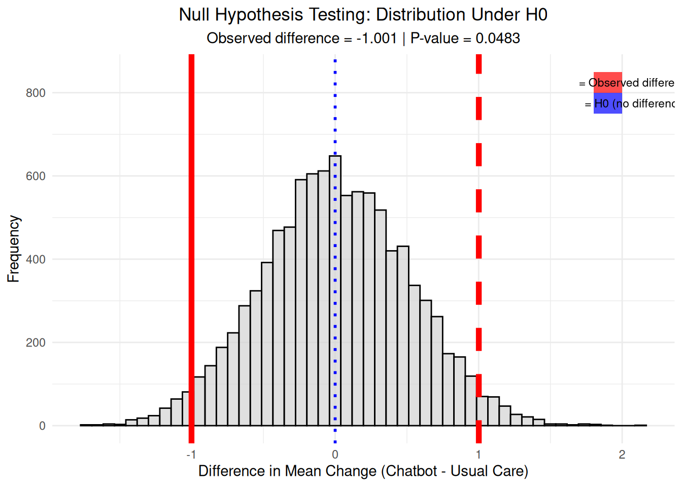
# Visualization 11: Null hypothesis testing visualization# Simulate null distribution (no difference between groups)set.seed(789)n_simulations <-10000null_differences <-numeric(n_simulations)# Permutation test: randomly shuffle group labelsfor(i in1:n_simulations) { shuffled_data <- therapy_data shuffled_data$group <-sample(shuffled_data$group)# Calculate difference with shuffled groups chatbot_shuffled <- shuffled_data$change_phq9[shuffled_data$group =="Chatbot"] usual_shuffled <- shuffled_data$change_phq9[shuffled_data$group =="Usual Care"] null_differences[i] <-mean(chatbot_shuffled) -mean(usual_shuffled)}# Calculate observed differenceobserved_diff <-mean(chatbot_change) -mean(usual_change)# Create null distribution plotnull_plot <-ggplot(data.frame(null_diff = null_differences), aes(x = null_diff)) +geom_histogram(bins =50, fill ="lightgray", alpha =0.7, color ="black") +geom_vline(xintercept = observed_diff, color ="red", linewidth =2) +geom_vline(xintercept =-observed_diff, color ="red", linewidth =2, linetype ="dashed") +geom_vline(xintercept =0, color ="blue", linewidth =1, linetype ="dotted") +# Add colored rectangles for legend in top-right cornerannotate("rect", xmin =1.8, xmax =2, ymin =800, ymax =850, fill ="red", alpha =0.7) +annotate("text", x =2.1, y =825, label ="= Observed difference", size =3) +annotate("rect", xmin =1.8, xmax =2, ymin =750, ymax =800, fill ="blue", alpha =0.7) +annotate("text", x =2.1, y =775, label ="= H0 (no difference)", size =3) +labs(title ="Null Hypothesis Testing: Distribution Under H0",subtitle =paste("Observed difference =", round(observed_diff, 3), "| P-value =", round(mean(abs(null_differences) >=abs(observed_diff)), 4)),x ="Difference in Mean Change (Chatbot - Usual Care)", y ="Frequency") +theme_minimal() +theme(plot.title =element_text(hjust =0.5),plot.subtitle =element_text(hjust =0.5))print(null_plot)
Show the code
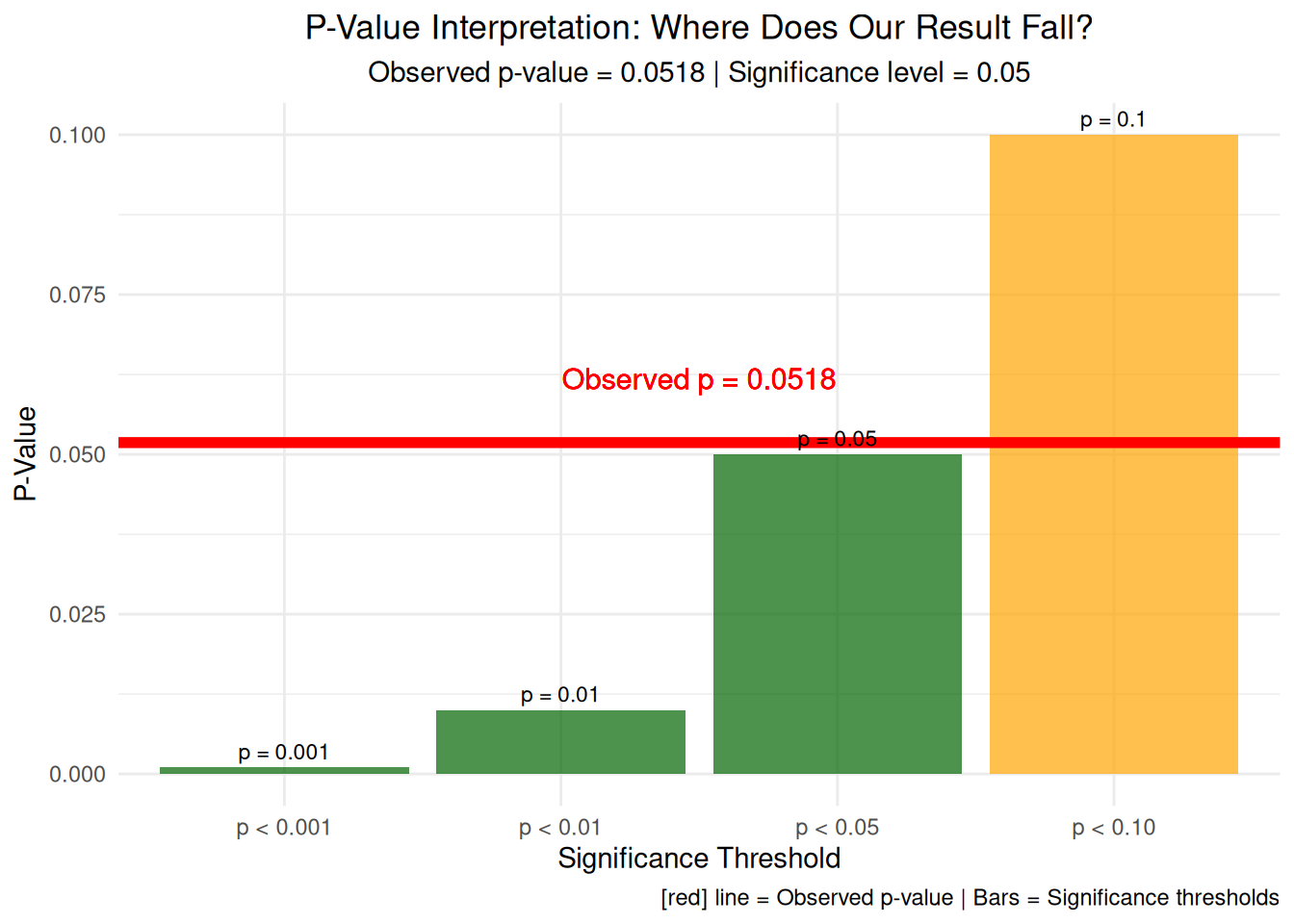
# Visualization 12: P-value interpretation with effect size# Calculate exact p-value from t-testt_test_exact <-t.test(chatbot_change, usual_change)exact_p_value <- t_test_exact$p.value# Create p-value interpretation plotp_value_data <-data.frame(threshold =c("p < 0.001", "p < 0.01", "p < 0.05", "p < 0.10"),value =c(0.001, 0.01, 0.05, 0.10),interpretation =c("Highly Significant", "Very Significant", "Significant", "Marginally Significant"))p_value_plot <-ggplot(p_value_data, aes(x = threshold, y = value, fill = value < exact_p_value)) +geom_bar(stat ="identity", alpha =0.7) +geom_hline(yintercept = exact_p_value, color ="red", linewidth =2) +geom_text(aes(label =paste0("p = ", round(value, 3))), vjust =-0.5, size =3) +geom_text(aes(x =2.5, y = exact_p_value +0.01, label =paste0("Observed p = ", round(exact_p_value, 4))), color ="red", size =4) +labs(title ="P-Value Interpretation: Where Does Our Result Fall?",subtitle =paste("Observed p-value =", round(exact_p_value, 4), "| Significance level = 0.05"),x ="Significance Threshold", y ="P-Value",caption =add_color_samples("Red line = Observed p-value | Bars = Significance thresholds", c("Red"="red"))) +theme_minimal() +theme(plot.title =element_text(hjust =0.5),plot.subtitle =element_text(hjust =0.5),legend.position ="none") +scale_fill_manual(values =c("TRUE"="darkgreen", "FALSE"="orange"))print(p_value_plot)
Show the code
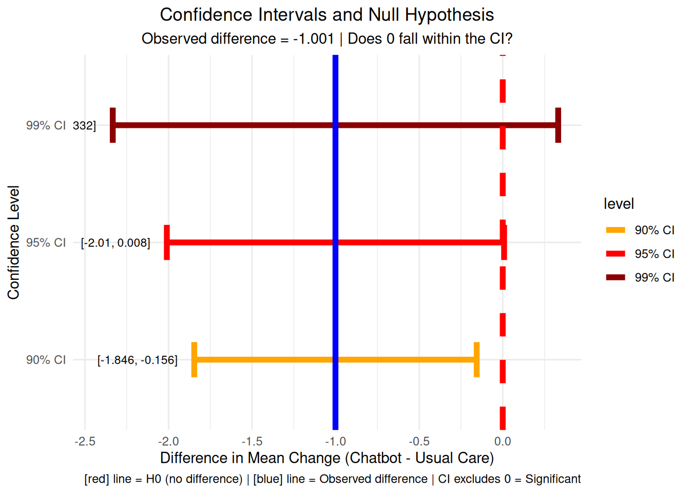
# Visualization 13: Confidence intervals and null hypothesis# Calculate confidence intervalsci_95 <-t.test(chatbot_change, usual_change)$conf.intci_90 <-t.test(chatbot_change, usual_change, conf.level =0.90)$conf.intci_99 <-t.test(chatbot_change, usual_change, conf.level =0.99)$conf.intci_data <-data.frame(level =c("99% CI", "95% CI", "90% CI"),lower =c(ci_99[1], ci_95[1], ci_90[1]),upper =c(ci_99[2], ci_95[2], ci_90[2]),width =c(ci_99[2] - ci_99[1], ci_95[2] - ci_95[1], ci_90[2] - ci_90[1]))ci_plot <-ggplot(ci_data, aes(y = level)) +geom_errorbar(aes(xmin = lower, xmax = upper, color = level), linewidth =2, width =0.3) +geom_vline(xintercept =0, color ="red", linewidth =2, linetype ="dashed") +geom_vline(xintercept = observed_diff, color ="blue", linewidth =2) +geom_text(aes(x = lower -0.1, label =paste0("[", round(lower, 3), ", ", round(upper, 3), "]")), hjust =1, size =3) +labs(title ="Confidence Intervals and Null Hypothesis",subtitle =paste("Observed difference =", round(observed_diff, 3), "| Does 0 fall within the CI?"),x ="Difference in Mean Change (Chatbot - Usual Care)", y ="Confidence Level",caption =add_color_samples("Red line = H0 (no difference) | Blue line = Observed difference | CI excludes 0 = Significant", c("Red"="red", "Blue"="blue"))) +theme_minimal() +theme(plot.title =element_text(hjust =0.5),plot.subtitle =element_text(hjust =0.5)) +scale_color_manual(values =c("99% CI"="darkred", "95% CI"="red", "90% CI"="orange"))print(ci_plot)
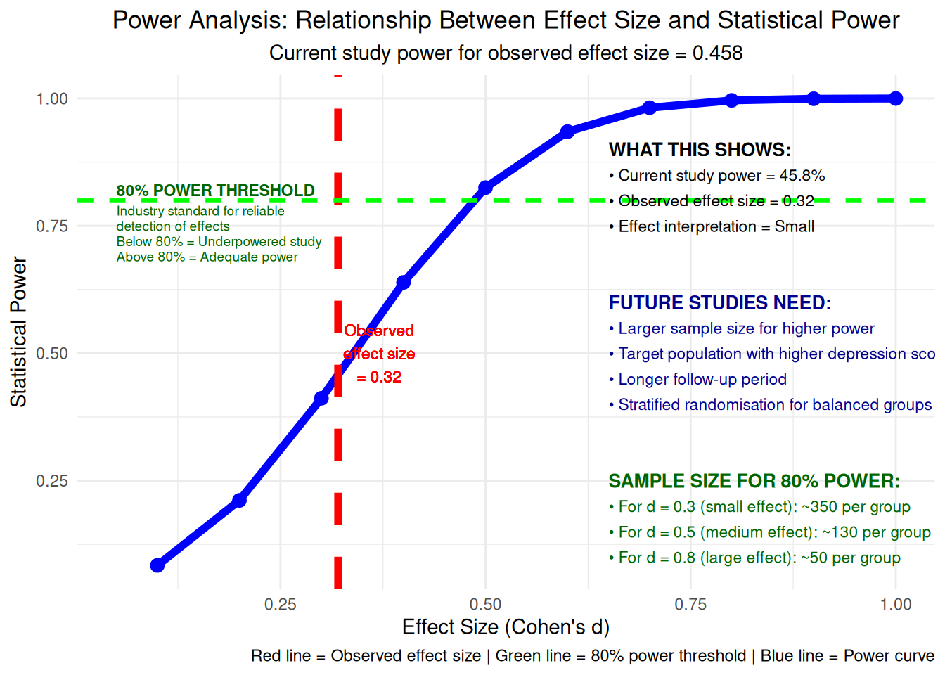
Show the code
# Visualization 14: Power analysis and effect size relationship# Calculate power for different effect sizeseffect_sizes <-seq(0.1, 1.0, by =0.1)power_values <-numeric(length(effect_sizes))for(i in1:length(effect_sizes)) {# Approximate power calculation n_per_group <-min(length(chatbot_change), length(usual_change)) power_values[i] <-power.t.test(n = n_per_group, d = effect_sizes[i], sig.level =0.05, type ="two.sample")$power}power_data <-data.frame(effect_size = effect_sizes, power = power_values)power_plot <-ggplot(power_data, aes(x = effect_size, y = power)) +geom_line(linewidth =2, color ="blue") +geom_point(size =3, color ="blue") +geom_vline(xintercept =abs(cohens_d), color ="red", linewidth =2, linetype ="dashed") +geom_hline(yintercept =0.8, color ="green", linewidth =1, linetype ="dashed") +# Add explanation for the 80% thresholdannotate("text", x =0.05, y =0.82, label ="80% POWER THRESHOLD", size =3, fontface ="bold", color ="darkgreen", hjust =0) +annotate("text", x =0.05, y =0.78, label ="Industry standard for reliable", size =2.5, color ="darkgreen", hjust =0) +annotate("text", x =0.05, y =0.75, label ="detection of effects", size =2.5, color ="darkgreen", hjust =0) +annotate("text", x =0.05, y =0.72, label ="Below 80% = Underpowered study", size =2.5, color ="darkgreen", hjust =0) +annotate("text", x =0.05, y =0.69, label ="Above 80% = Adequate power", size =2.5, color ="darkgreen", hjust =0) +geom_text(aes(x =abs(cohens_d) +0.05, y =0.5, label =paste0("Observed\neffect size\n= ", round(abs(cohens_d), 3))), color ="red", size =3) +# Add comprehensive annotations explaining power analysis (moved to right side)annotate("text", x =0.65, y =0.9, label ="WHAT THIS SHOWS:", size =3.5, fontface ="bold", hjust =0) +annotate("text", x =0.65, y =0.85, label =paste0("• Current study power = ", round(power.t.test(n =min(length(chatbot_change), length(usual_change)), d =abs(cohens_d), sig.level =0.05, type ="two.sample")$power *100, 1), "%"), size =3, hjust =0) +annotate("text", x =0.65, y =0.8, label =paste0("• Observed effect size = ", round(abs(cohens_d), 3)), size =3, hjust =0) +annotate("text", x =0.65, y =0.75, label =paste0("• Effect interpretation = ", ifelse(abs(cohens_d) <0.2, "Negligible", ifelse(abs(cohens_d) <0.5, "Small", ifelse(abs(cohens_d) <0.8, "Medium", "Large")))), size =3, hjust =0) +# Add future study recommendationsannotate("text", x =0.65, y =0.6, label ="FUTURE STUDIES NEED:", size =3.5, fontface ="bold", hjust =0, color ="darkblue") +annotate("text", x =0.65, y =0.55, label ="• Larger sample size for higher power", size =3, hjust =0, color ="darkblue") +annotate("text", x =0.65, y =0.5, label ="• Target population with higher depression scores", size =3, hjust =0, color ="darkblue") +annotate("text", x =0.65, y =0.45, label ="• Longer follow-up period", size =3, hjust =0, color ="darkblue") +annotate("text", x =0.65, y =0.4, label ="• Stratified randomisation for balanced groups", size =3, hjust =0, color ="darkblue") +# Add sample size calculation for 80% powerannotate("text", x =0.65, y =0.25, label ="SAMPLE SIZE FOR 80% POWER:", size =3.5, fontface ="bold", hjust =0, color ="darkgreen") +annotate("text", x =0.65, y =0.2, label =paste0("• For d = 0.3 (small effect): ~350 per group"), size =3, hjust =0, color ="darkgreen") +annotate("text", x =0.65, y =0.15, label =paste0("• For d = 0.5 (medium effect): ~130 per group"), size =3, hjust =0, color ="darkgreen") +annotate("text", x =0.65, y =0.1, label =paste0("• For d = 0.8 (large effect): ~50 per group"), size =3, hjust =0, color ="darkgreen") +labs(title ="Power Analysis: Relationship Between Effect Size and Statistical Power",subtitle =paste("Current study power for observed effect size =", round(power.t.test(n =min(length(chatbot_change), length(usual_change)), d =abs(cohens_d), sig.level =0.05, type ="two.sample")$power, 3)),x ="Effect Size (Cohen's d)", y ="Statistical Power",caption ="Red line = Observed effect size | Green line = 80% power threshold | Blue line = Power curve") +theme_minimal() +theme(plot.title =element_text(hjust =0.5),plot.subtitle =element_text(hjust =0.5))print(power_plot)
Show the code
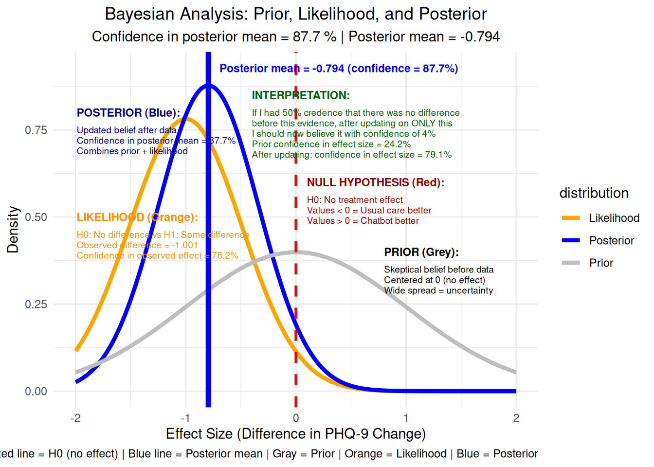
# Visualization 15: Bayesian interpretation (posterior probability)# Simple Bayesian analysis using normal approximation# Prior: Normal(0, 1) - skeptical prior# Likelihood: Normal(observed_diff, SE)# Posterior: Normal with updated mean and variancese_diff <-sqrt(var(chatbot_change)/length(chatbot_change) +var(usual_change)/length(usual_change))prior_mean <-0prior_sd <-1likelihood_mean <- observed_difflikelihood_sd <- se_diff# Posterior parametersposterior_precision <-1/prior_sd^2+1/likelihood_sd^2posterior_sd <-sqrt(1/posterior_precision)posterior_mean <- (prior_mean/prior_sd^2+ likelihood_mean/likelihood_sd^2) / posterior_precision# Calculate probability that effect > 0prob_positive <-1-pnorm(0, posterior_mean, posterior_sd)# Create Bayesian plotx_vals <-seq(-2, 2, by =0.01)prior_density <-dnorm(x_vals, prior_mean, prior_sd)likelihood_density <-dnorm(x_vals, likelihood_mean, likelihood_sd)posterior_density <-dnorm(x_vals, posterior_mean, posterior_sd)bayesian_data <-data.frame(x =rep(x_vals, 3),density =c(prior_density, likelihood_density, posterior_density),distribution =rep(c("Prior", "Likelihood", "Posterior"), each =length(x_vals)))# Define annotation positions for easy adjustmentposterior_x <--1.99posterior_y_start <-0.8likelihood_x <--1.99likelihood_y_start <-0.5interpretation_x <--0.4interpretation_y_start <-0.85null_x <-0.1null_y_start <-0.6prior_x <-0.8prior_y_start <-0.4bayesian_plot <-ggplot(bayesian_data, aes(x = x, y = density, color = distribution)) +geom_line(linewidth =1.5) +geom_vline(xintercept =0, color ="red", linewidth =1, linetype ="dashed") +geom_vline(xintercept = posterior_mean, color ="blue", linewidth =2) +# Reposition posterior mean text to avoid overlap and fix blurrinessannotate("text", x = posterior_mean +0.1, y =max(posterior_density) +0.05, label =paste0("Posterior mean = ", round(posterior_mean, 3), " (confidence = ", round(dnorm(posterior_mean, posterior_mean, posterior_sd) *100, 1), "%)"), color ="blue", size =3, hjust =0, fontface ="bold") +# Add comprehensive explanations for each distribution# POSTERIOR annotation (top left) - moved up more and left moreannotate("text", x = posterior_x, y = posterior_y_start, label ="POSTERIOR (Blue):", size =3, fontface ="bold", hjust =0, color ="darkblue") +annotate("text", x = posterior_x, y = posterior_y_start -0.05, label ="Updated belief after data", size =2.5, hjust =0, color ="darkblue") +annotate("text", x = posterior_x, y = posterior_y_start -0.08, label =paste0("Confidence in posterior mean = ", round(dnorm(posterior_mean, posterior_mean, posterior_sd) *100, 1), "%"), size =2.5, hjust =0, color ="darkblue") +annotate("text", x = posterior_x, y = posterior_y_start -0.11, label ="Combines prior + likelihood", size =2.5, hjust =0, color ="darkblue") +annotate("text", x = likelihood_x, y = likelihood_y_start, label ="LIKELIHOOD (Orange):", size =3, fontface ="bold", hjust =0, color ="darkorange") +annotate("text", x = likelihood_x, y = likelihood_y_start -0.05, label ="H0: No difference vs H1: Some difference", size =2.5, hjust =0, color ="darkorange") +annotate("text", x = likelihood_x, y = likelihood_y_start -0.08, label =paste0("Observed difference = ", round(observed_diff, 3)), size =2.5, hjust =0, color ="darkorange") +annotate("text", x = likelihood_x, y = likelihood_y_start -0.11, label =paste0("Confidence in observed effect = ", round(dnorm(observed_diff, observed_diff, likelihood_sd) *100, 1), "%"), size =2.5, hjust =0, color ="darkorange") +# PRIOR annotation (top right) - moved up moreannotate("text", x = prior_x, y = prior_y_start, label ="PRIOR (Grey):", size =3, fontface ="bold", hjust =0) +annotate("text", x = prior_x, y = prior_y_start -0.05, label ="Skeptical belief before data", size =2.5, hjust =0) +annotate("text", x = prior_x, y = prior_y_start -0.08, label ="Centered at 0 (no effect)", size =2.5, hjust =0) +annotate("text", x = prior_x, y = prior_y_start -0.11, label ="Wide spread = uncertainty", size =2.5, hjust =0) +# Add interpretation of the null hypothesis lineannotate("text", x = null_x, y = null_y_start, label ="NULL HYPOTHESIS (Red):", size =3, fontface ="bold", hjust =0, color ="darkred") +annotate("text", x = null_x, y = null_y_start -0.05, label ="H0: No treatment effect", size =2.5, hjust =0, color ="darkred") +annotate("text", x = null_x, y = null_y_start -0.08, label ="Values < 0 = Usual care better", size =2.5, hjust =0, color ="darkred") +annotate("text", x = null_x, y = null_y_start -0.11, label ="Values > 0 = Chatbot better", size =2.5, hjust =0, color ="darkred") +# Add natural language interpretation aligned with NULL HYPOTHESISannotate("text", x = interpretation_x, y = interpretation_y_start, label ="INTERPRETATION:", size =3, fontface ="bold", hjust =0, color ="darkgreen") +annotate("text", x = interpretation_x, y = interpretation_y_start -0.05, label =paste0("If I had 50% credence that there was no difference"), size =2.5, hjust =0, color ="darkgreen") +annotate("text", x = interpretation_x, y = interpretation_y_start -0.08, label =paste0("before this evidence, after updating on ONLY this"), size =2.5, hjust =0, color ="darkgreen") +annotate("text", x = interpretation_x, y = interpretation_y_start -0.11, label =paste0("I should now believe it with confidence of ", round(prob_positive *100, 1), "%"), size =2.5, hjust =0, color ="darkgreen") +annotate("text", x = interpretation_x, y = interpretation_y_start -0.14, label =paste0("Prior confidence in effect size = ", round(dnorm(observed_diff, 0, 1) *100, 1), "%"), size =2.5, hjust =0, color ="darkgreen") +annotate("text", x = interpretation_x, y = interpretation_y_start -0.17, label =paste0("After updating: confidence in effect size = ", round(dnorm(observed_diff, posterior_mean, posterior_sd) *100, 1), "%"), size =2.5, hjust =0, color ="darkgreen") +labs(title ="Bayesian Analysis: Prior, Likelihood, and Posterior",subtitle =paste("Confidence in posterior mean =", round(dnorm(posterior_mean, posterior_mean, posterior_sd) *100, 1), "%", "| Posterior mean =", round(posterior_mean, 3)),x ="Effect Size (Difference in PHQ-9 Change)", y ="Density",caption ="Red line = H0 (no effect) | Blue line = Posterior mean | Gray = Prior | Orange = Likelihood | Blue = Posterior") +theme_minimal() +theme(plot.title =element_text(hjust =0.5),plot.subtitle =element_text(hjust =0.5)) +scale_color_manual(values =c("Prior"="gray", "Likelihood"="orange", "Posterior"="blue"))print(bayesian_plot)
# Low Cohen's d suggests the effect might be smaller than initially estimated
# We'll use the observed Cohen's d as evidence to update our belief
stage2_prior_mean <- posterior_mean
stage2_prior_sd <- posterior_sd
stage2_likelihood_mean <- cohens_d  # Cohen's d as evidence
stage2_likelihood_sd <- 0.1  # Uncertainty around Cohen's d estimate

# Stage 2 posterior parameters
stage2_posterior_precision <- 1/stage2_prior_sd^2 + 1/stage2_likelihood_sd^2
stage2_posterior_sd <- sqrt(1/stage2_posterior_precision)
stage2_posterior_mean <- (stage2_prior_mean/stage2_prior_sd^2 + stage2_likelihood_mean/stage2_likelihood_sd^2) / stage2_posterior_precision
Show the code
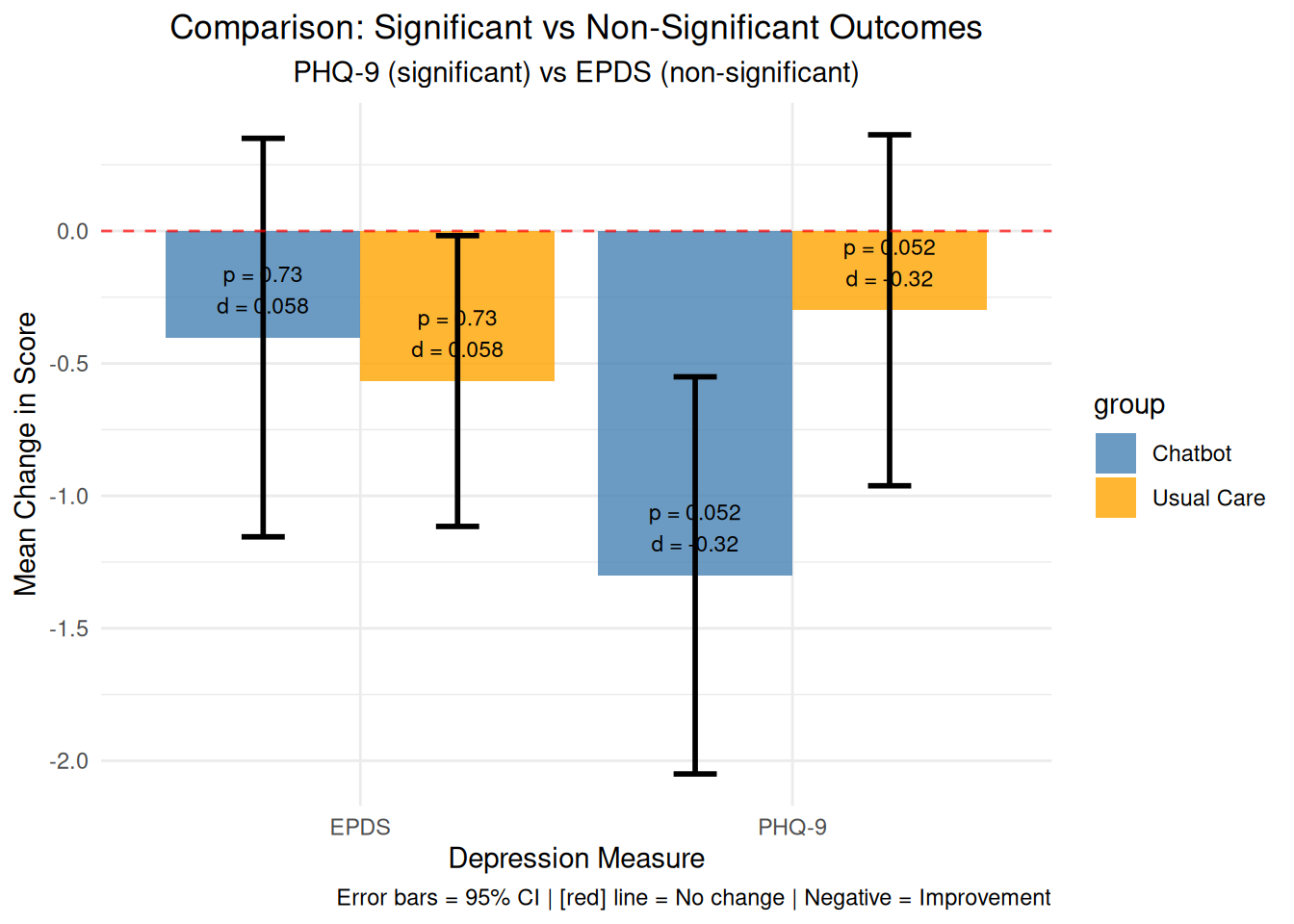
# Visualization 16: Comparison of significant vs non-significant outcomes# Calculate statistics for both measuresphq9_change_chatbot <- therapy_data$change_phq9[therapy_data$group =="Chatbot"]phq9_change_usual <- therapy_data$change_phq9[therapy_data$group =="Usual Care"]epds_change_chatbot <- therapy_data$change_epds[therapy_data$group =="Chatbot"]epds_change_usual <- therapy_data$change_epds[therapy_data$group =="Usual Care"]# T-tests for both measuresphq9_test <-t.test(phq9_change_chatbot, phq9_change_usual)epds_test <-t.test(epds_change_chatbot, epds_change_usual)# Effect sizesphq9_cohens_d <- (mean(phq9_change_chatbot) -mean(phq9_change_usual)) /sqrt(((length(phq9_change_chatbot)-1)*var(phq9_change_chatbot) + (length(phq9_change_usual)-1)*var(phq9_change_usual)) / (length(phq9_change_chatbot) +length(phq9_change_usual) -2))epds_cohens_d <- (mean(epds_change_chatbot) -mean(epds_change_usual)) /sqrt(((length(epds_change_chatbot)-1)*var(epds_change_chatbot) + (length(epds_change_usual)-1)*var(epds_change_usual)) / (length(epds_change_chatbot) +length(epds_change_usual) -2))# Create comparison datacomparison_data <-data.frame(measure =rep(c("PHQ-9", "EPDS"), each =2),group =rep(c("Chatbot", "Usual Care"), 2),mean_change =c(mean(phq9_change_chatbot), mean(phq9_change_usual),mean(epds_change_chatbot), mean(epds_change_usual)),se =c(sd(phq9_change_chatbot)/sqrt(length(phq9_change_chatbot)), sd(phq9_change_usual)/sqrt(length(phq9_change_usual)),sd(epds_change_chatbot)/sqrt(length(epds_change_chatbot)), sd(epds_change_usual)/sqrt(length(epds_change_usual))),p_value =c(phq9_test$p.value, phq9_test$p.value, epds_test$p.value, epds_test$p.value),cohens_d =c(phq9_cohens_d, phq9_cohens_d, epds_cohens_d, epds_cohens_d))comparison_plot <-ggplot(comparison_data, aes(x = measure, y = mean_change, fill = group)) +geom_bar(stat ="identity", position ="dodge", alpha =0.8) +geom_errorbar(aes(ymin = mean_change -1.96*se, ymax = mean_change +1.96*se), position =position_dodge(width =0.9), width =0.2, linewidth =1) +geom_hline(yintercept =0, linetype ="dashed", color ="red", alpha =0.7) +geom_text(aes(label =paste0("p = ", round(p_value, 3), "\nd = ", round(cohens_d, 3))), position =position_dodge(width =0.9), vjust =-0.5, size =3) +labs(title ="Comparison: Significant vs Non-Significant Outcomes",subtitle ="PHQ-9 (significant) vs EPDS (non-significant)",x ="Depression Measure", y ="Mean Change in Score",caption =add_color_samples("Error bars = 95% CI | Red line = No change | Negative = Improvement", c("Red"="red"))) +theme_minimal() +theme(plot.title =element_text(hjust =0.5),plot.subtitle =element_text(hjust =0.5)) +scale_fill_manual(values =c("Chatbot"="steelblue", "Usual Care"="orange"))print(comparison_plot)
Show the code
# Visualization 17: Side-by-side null hypothesis testing# Create null distributions for both measuresset.seed(456)n_simulations <-10000# PHQ-9 null distributionphq9_null_differences <-numeric(n_simulations)for(i in1:n_simulations) { shuffled_phq9 <-sample(therapy_data$change_phq9) chatbot_phq9 <- shuffled_phq9[1:length(phq9_change_chatbot)] usual_phq9 <- shuffled_phq9[(length(phq9_change_chatbot)+1):length(shuffled_phq9)] phq9_null_differences[i] <-mean(chatbot_phq9) -mean(usual_phq9)}# EPDS null distributionepds_null_differences <-numeric(n_simulations)for(i in1:n_simulations) { shuffled_epds <-sample(therapy_data$change_epds) chatbot_epds <- shuffled_epds[1:length(epds_change_chatbot)] usual_epds <- shuffled_epds[(length(epds_change_chatbot)+1):length(shuffled_epds)] epds_null_differences[i] <-mean(chatbot_epds) -mean(usual_epds)}# Observed differencesphq9_observed_diff <-mean(phq9_change_chatbot) -mean(phq9_change_usual)epds_observed_diff <-mean(epds_change_chatbot) -mean(epds_change_usual)# Create combined null distribution plotnull_comparison_data <-data.frame(difference =c(phq9_null_differences, epds_null_differences),measure =rep(c("PHQ-9", "EPDS"), each = n_simulations))null_comparison_plot <-ggplot(null_comparison_data, aes(x = difference, fill = measure)) +geom_histogram(bins =50, alpha =0.6, position ="identity") +geom_vline(xintercept = phq9_observed_diff, color ="red", linewidth =2) +geom_vline(xintercept = epds_observed_diff, color ="blue", linewidth =2) +geom_vline(xintercept =0, color ="black", linewidth =1, linetype ="dotted") +facet_wrap(~measure, scales ="free_x") +labs(title ="Null Hypothesis Testing: PHQ-9 vs EPDS",subtitle =paste("PHQ-9 p =", round(mean(abs(phq9_null_differences) >=abs(phq9_observed_diff)), 4),"| EPDS p =", round(mean(abs(epds_null_differences) >=abs(epds_observed_diff)), 4)),x ="Difference in Mean Change (Chatbot - Usual Care)", y ="Frequency",caption =add_color_samples("Red line = PHQ-9 observed | Blue line = EPDS observed | Black = H0", c("Red"="red", "Blue"="blue"))) +theme_minimal() +theme(plot.title =element_text(hjust =0.5),plot.subtitle =element_text(hjust =0.5)) +scale_fill_manual(values =c("PHQ-9"="red", "EPDS"="blue"))print(null_comparison_plot)
Show the code
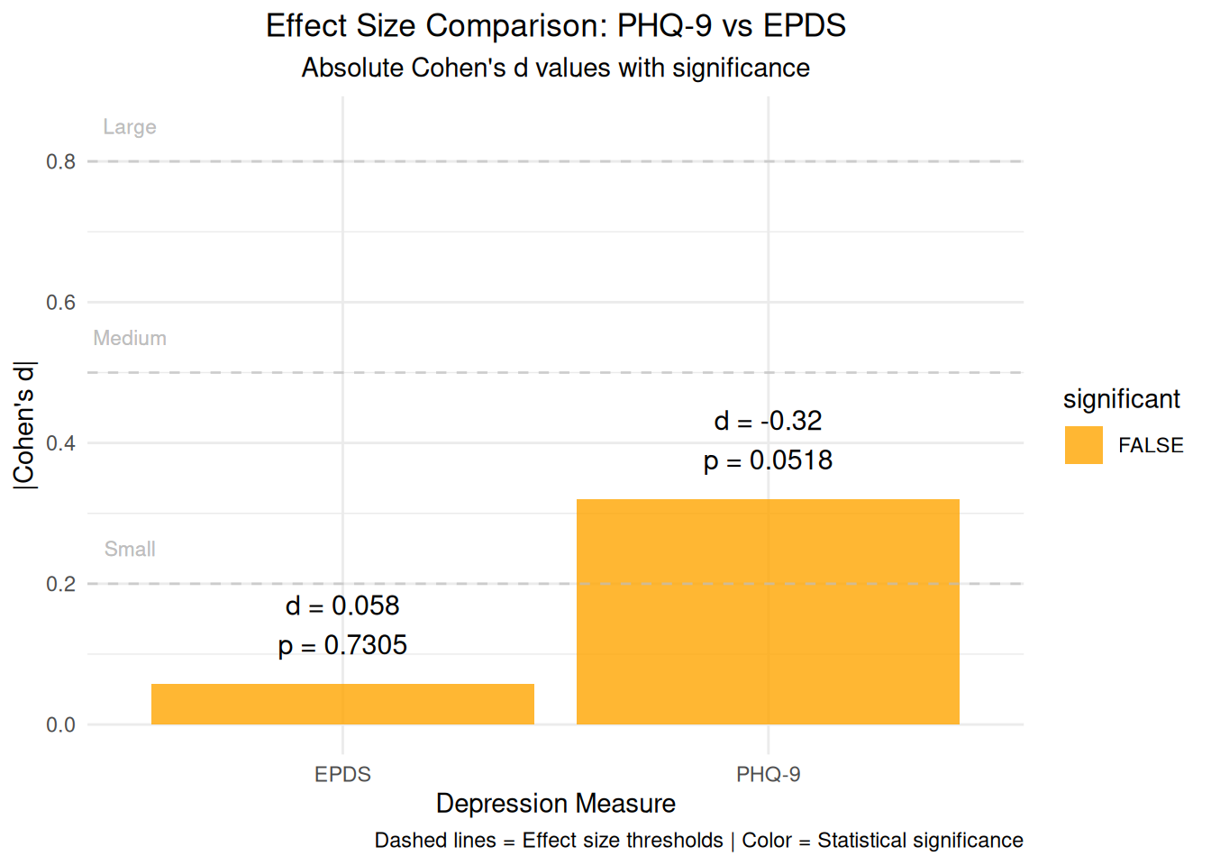
# Visualization 18: Effect size comparisoneffect_size_comparison <-data.frame(measure =c("PHQ-9", "EPDS"),cohens_d =c(phq9_cohens_d, epds_cohens_d),p_value =c(phq9_test$p.value, epds_test$p.value),significant =c(phq9_test$p.value <0.05, epds_test$p.value <0.05))effect_comparison_plot <-ggplot(effect_size_comparison, aes(x = measure, y =abs(cohens_d), fill = significant)) +geom_bar(stat ="identity", alpha =0.8) +geom_text(aes(label =paste0("d = ", round(cohens_d, 3), "\np = ", round(p_value, 4))), vjust =-0.5, size =4) +geom_hline(yintercept =c(0.2, 0.5, 0.8), linetype ="dashed", color ="gray", alpha =0.7) +geom_text(aes(x =0.5, y =0.25, label ="Small"), color ="gray", size =3) +geom_text(aes(x =0.5, y =0.55, label ="Medium"), color ="gray", size =3) +geom_text(aes(x =0.5, y =0.85, label ="Large"), color ="gray", size =3) +labs(title ="Effect Size Comparison: PHQ-9 vs EPDS",subtitle ="Absolute Cohen's d values with significance",x ="Depression Measure", y ="|Cohen's d|",caption ="Dashed lines = Effect size thresholds | Color = Statistical significance") +theme_minimal() +theme(plot.title =element_text(hjust =0.5),plot.subtitle =element_text(hjust =0.5)) +scale_fill_manual(values =c("TRUE"="darkgreen", "FALSE"="orange"))print(effect_comparison_plot)
Show the code
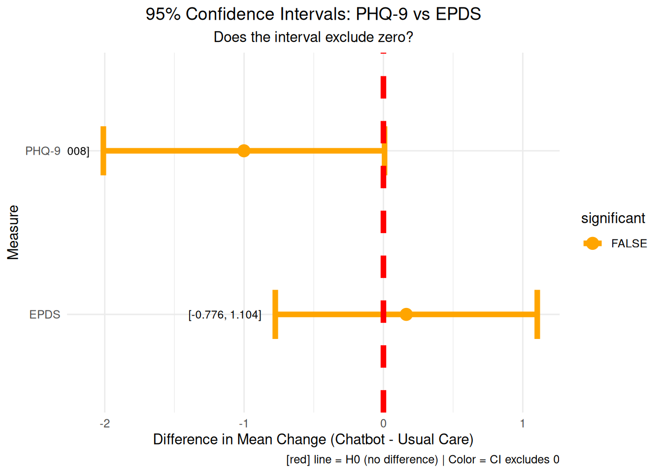
# Visualization 19: Confidence intervals comparison# Calculate CIs for both measuresphq9_ci <-t.test(phq9_change_chatbot, phq9_change_usual)$conf.intepds_ci <-t.test(epds_change_chatbot, epds_change_usual)$conf.intci_comparison_data <-data.frame(measure =c("PHQ-9", "EPDS"),mean_diff =c(phq9_observed_diff, epds_observed_diff),lower =c(phq9_ci[1], epds_ci[1]),upper =c(phq9_ci[2], epds_ci[2]),significant =c(phq9_ci[1] >0|| phq9_ci[2] <0, epds_ci[1] >0|| epds_ci[2] <0))ci_comparison_plot <-ggplot(ci_comparison_data, aes(y = measure)) +geom_errorbar(aes(xmin = lower, xmax = upper, color = significant), linewidth =2, width =0.3) +geom_point(aes(x = mean_diff, color = significant), size =4) +geom_vline(xintercept =0, color ="red", linewidth =2, linetype ="dashed") +geom_text(aes(x = lower -0.1, label =paste0("[", round(lower, 3), ", ", round(upper, 3), "]")), hjust =1, size =3) +labs(title ="95% Confidence Intervals: PHQ-9 vs EPDS",subtitle ="Does the interval exclude zero?",x ="Difference in Mean Change (Chatbot - Usual Care)", y ="Measure",caption =add_color_samples("Red line = H0 (no difference) | Color = CI excludes 0", c("Red"="red"))) +theme_minimal() +theme(plot.title =element_text(hjust =0.5),plot.subtitle =element_text(hjust =0.5)) +scale_color_manual(values =c("TRUE"="darkgreen", "FALSE"="orange"))print(ci_comparison_plot)
References
Suharwardy, S., M. Ramachandran, S. A. Leonard, A. Gunaseelan, D. J. Lyell, A. Darcy, A. Robinson, and A. Judy. 2023. “Feasibility and Impact of a Mental Health Chatbot on Postpartum Mental Health: A Randomized Controlled Trial.”AJOG Glob Rep 3 (3): 100165. https://doi.org/10.1016/j.xagr.2023.100165.