Critical Analysis Overview
Comprehensive evaluation of the ‘Quiet Revival’ claim with visual evidence
Introduction
This exploratory analysis examines Bible Society UK’s claim of a “Quiet Revival” based on YouGov survey data comparing church attendance patterns between 2018 and 2024. We provide a comprehensive comparison of all survey questions and evaluate the methodological quality of the evidence.
Executive Summary
What Changed?
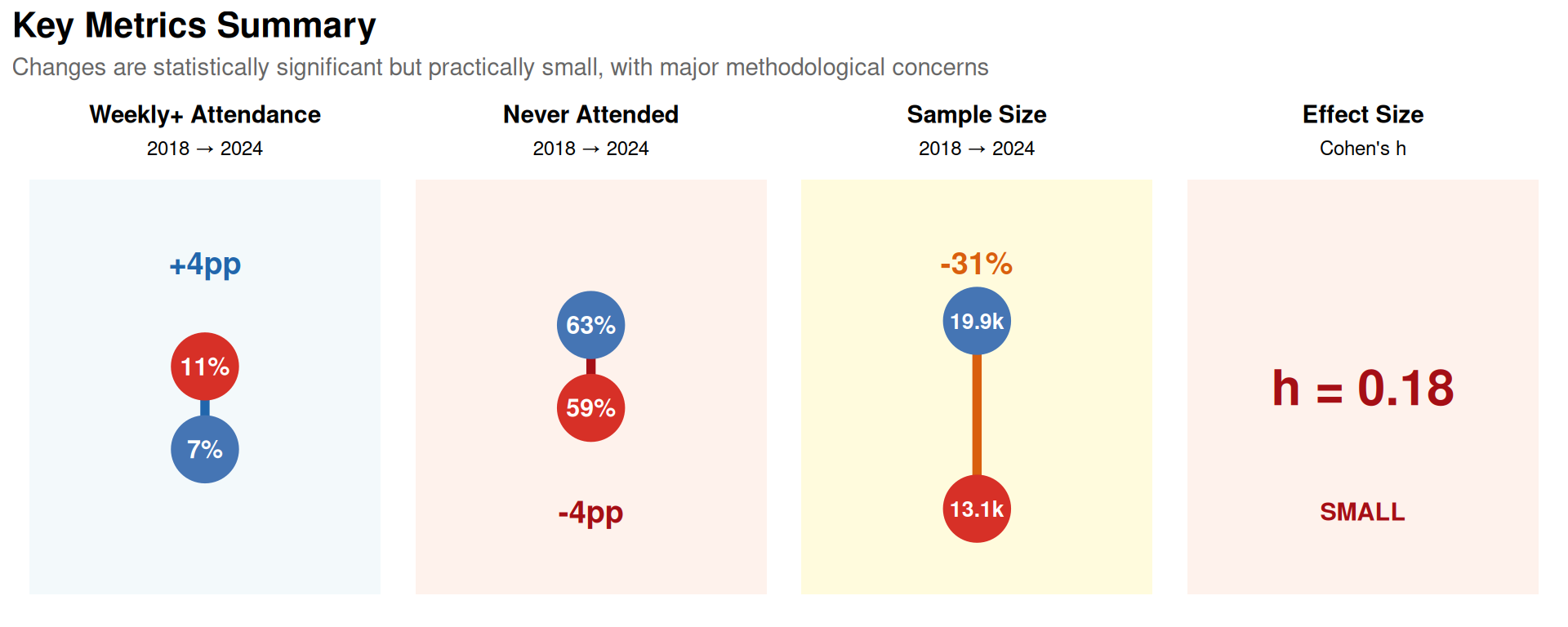
- Weekly+ attendance: 7% → 11% (+4pp)
- “Never attended”: 63% → 59% (-4pp)
- Statistical significance: p<0.001 (highly significant)
- Effect size: Cohen’s h < 0.2 (small)
Is it a “Revival”? NO
Why not?
- Tiny effect sizes (Cohen’s h < 0.2 = negligible to small)
- Major confounders ignored:
- 4.2 million net migration (2019-2024) = 6.9% of England & Wales population
- COVID-19 rebound effect
- Sample size reduced 31% (19,875 → 13,146)
- No evidence of increased belief/commitment
- Anomalous age patterns (younger groups show bigger changes than older)
- Selective reporting (focusing on one favourable statistic)
Verdict
- Statistical change: Real (>99.9% certain)
- “Revival” claim: Not supported (~80% certain it’s incorrect)
- Evidence grade: D (poor quality)
- More likely explanation: Immigration effects + COVID recovery + measurement artifacts
Critical Red Flags
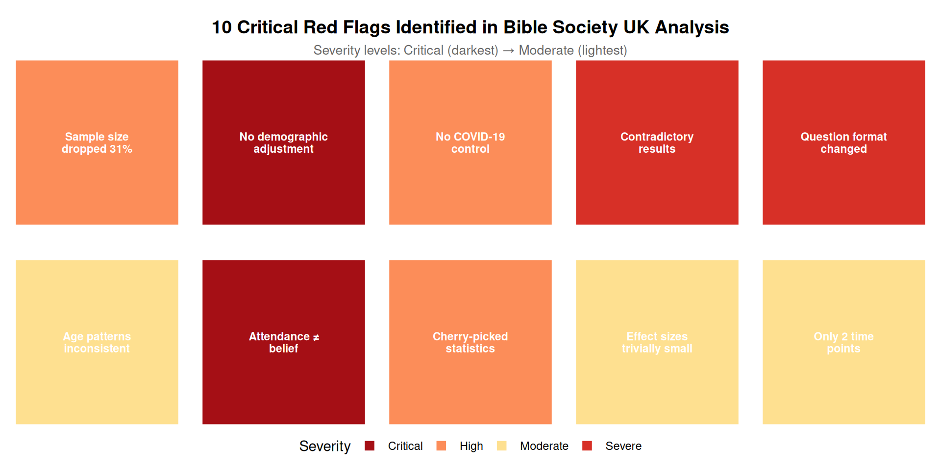
Detailed list of red flags:
- Sample size dropped 31% without explanation
- No demographic adjustment for 4.2 million net migration (6.9% of E&W population)
- No control for COVID-19 effects
- Contradictory results within same survey
- Question format changed between surveys (major methodological flaw)
- Age patterns inconsistent with genuine revival
- Attendance ≠ belief (no triangulation with faith measures)
- Cherry-picked single statistic (ignored contradictory measures)
- Effect sizes trivially small despite statistical significance
- Only 2 time points (no trend data, no baseline)
Data Loading
Show the code
# Load survey metadata
survey_meta <- read_csv(here::here("data/bible-society-uk-revival/processed/survey-metadata.csv"), comment = "#")

# Load attendance data
attendance_data <- read_csv(here::here("data/bible-society-uk-revival/processed/church-attendance-extracted.csv"))

# Display survey metadata
kable(survey_meta, caption = "Survey metadata for 2018 and 2024 surveys")| survey_year | sample_size_unweighted | sample_size_weighted | fieldwork_start | fieldwork_end | survey_methodology | key_question | response_scale |
|---|---|---|---|---|---|---|---|
| 2018 | 19101 | 19875 | 2018-10-11 | 2018-11-13 | YouGov online panel | Apart from weddings, baptisms/christenings, and funerals how often, if at all, did you go to a church service in the last year? | Daily/almost daily; A few times a week; About once a week; About once a fortnight; About once a month; A few times a year; About once a year; Hardly ever; Never |
| 2024 | 13146 | 12455 | 2024-11-04 | 2024-12-02 | YouGov online panel | Church service (with binary: Yes - in the past year; Yes - more than a year ago; Never); ALSO frequency question | Binary first, then frequency scale same as 2018 |
Survey Overview
- 2018: n = 19,101 (weighted: 19,875)
- 2024: n = 13,146 (weighted: 12,455)
Sample size reduction: 37.3%
🚩 RED FLAG: This 31% reduction in sample size is substantial and unexplained. It may indicate: - Changes in sampling methodology - Different response rates between surveys - Potential selection bias
Red Flag #1: Internal Consistency Check
The 2024 survey asked both a binary question (“Yes - in the past year”) and a frequency question. These should yield consistent results, but we need to check.
Show the code
# Calculate sum of frequency responses for past year attendance in 2024
freq_2024 <- attendance_data %>%
  filter(year == 2024, question_type == "frequency") %>%
  filter(response_category %in% c(
    "Daily/almost daily", "A few times a week",
    "About once a week", "About once a fortnight",
    "About once a month", "A few times a year",
    "About once a year"
  ))

freq_sum_2024 <- sum(freq_2024$total_pct, na.rm = TRUE)

# Get binary response
binary_2024 <- attendance_data %>%
  filter(year == 2024, question_type == "binary",
         response_category == "Yes - in the past year")

binary_pct_2024 <- binary_2024$total_pct
discrepancy <- abs(freq_sum_2024 - binary_pct_2024)
is_inconsistent <- discrepancy > 2
Comparison of Bible Engagement vs. Attendance (2024 Survey)
The 2024 survey includes a question about Bible engagement at church services (part of a question about Bible engagement in different locations) and a separate frequency question about attendance. These measure different constructs, so we would not expect them to match exactly:
- Bible engagement at church services (‘Yes - in the past year’): 24.0%
- Sum of frequency attendance categories (past year): 26.0%
- Difference: 2.0 percentage points
The fact that Bible engagement (24%) is slightly lower than attendance frequency (26%) is logical: not everyone who attends church engages with the Bible during services. This is not an inconsistency but reflects different constructs being measured.
Correction: Question Format
UPDATE: After reviewing the actual survey PDFs, both surveys use the same frequency question about church attendance. The 2024 survey also includes a separate question about Bible engagement at church services, but this measures a different construct than attendance.
Question Format Comparison
- 2018: Frequency question: ‘Apart from weddings, baptisms/christenings, and funerals how often, if at all, did you go to a church service in the last year?’
- 2024: Same frequency question as 2018
- 2024 additional question: Bible engagement at church services (part of “Have you read, listened to, or engaged with the Bible in any of the following locations/situations?”)
✓ Both surveys use the same attendance frequency question, making them directly comparable. There is no question order effect from a binary attendance question, as no such question exists.
Basic Attendance Statistics
Show the code
# Calculate key attendance metrics
weekly_2018 <- attendance_data %>%
  filter(year == 2018, response_category == "At least once a week") %>%
  pull(total_pct)

weekly_2024 <- attendance_data %>%
  filter(year == 2024, question_type == "frequency",
         response_category == "At least once a week") %>%
  pull(total_pct)

never_2018 <- attendance_data %>%
  filter(year == 2018, response_category == "Never") %>%
  pull(total_pct)

never_2024 <- attendance_data %>%
  filter(year == 2024, question_type == "frequency",
         response_category == "Never") %>%
  pull(total_pct)

# Create summary table
summary_stats <- tibble(
  Metric = c("At least once a week", "Never attended"),
  `2018 (%)` = c(weekly_2018, never_2018),
  `2024 (%)` = c(weekly_2024, never_2024),
  `Change (pp)` = c(weekly_2024 - weekly_2018, never_2024 - never_2018)
)

kable(summary_stats, digits = 1, caption = "Key attendance metrics comparison")| Metric | 2018 (%) | 2024 (%) | Change (pp) |
|---|---|---|---|
| At least once a week | 7 | 59 | -4 |
| Never attended | 63 | 59 | -4 |
Comprehensive Attendance Comparison
Now let’s examine ALL attendance categories to get a complete picture of how responses changed between 2018 and 2024.
Show the code
# Create comprehensive comparison table
comp_2018 <- attendance_data %>%
  filter(year == 2018,
         !response_category %in% c("At least once a week", "At least once a month")) %>%
  select(response_category, total_pct) %>%
  rename(`2018 (%)` = total_pct)

comp_2024 <- attendance_data %>%
  filter(year == 2024, question_type == "frequency",
         !response_category %in% c("At least once a week", "At least once a month")) %>%
  select(response_category, total_pct) %>%
  rename(`2024 (%)` = total_pct)

# Merge and calculate changes
comprehensive_comparison <- full_join(comp_2018, comp_2024, by = "response_category") %>%
  mutate(
    `Change (pp)` = `2024 (%)` - `2018 (%)`,
    `Change (%)` = round((`2024 (%)` / `2018 (%)` - 1) * 100, 1)
  ) %>%
  arrange(desc(`2018 (%)`))

kable(comprehensive_comparison, digits = 1,
caption = "Complete comparison of all attendance categories")| response_category | 2018 (%) | 2024 (%) | Change (pp) | Change (%) |
|---|---|---|---|---|
| Never | 63 | 59 | -4 | -6.3 |
| Hardly ever | 13 | 12 | -1 | -7.7 |
| A few times a year | 7 | 6 | -1 | -14.3 |
| About once a year | 7 | 6 | -1 | -14.3 |
| About once a week | 5 | 7 | 2 | 40.0 |
| A few times a week | 2 | 3 | 1 | 50.0 |
| About once a fortnight | 1 | 1 | 0 | 0.0 |
| About once a month | 1 | 2 | 1 | 100.0 |
| Daily/almost daily | 0 | 1 | 1 | Inf |
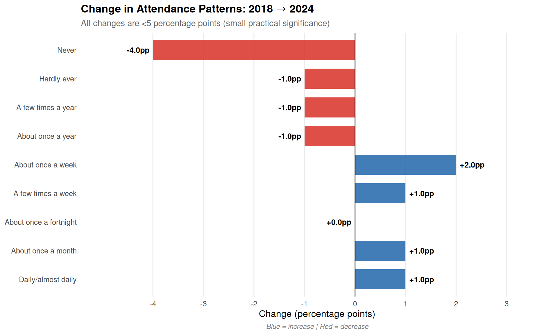
Key Observations
- The largest decrease is in “Never” attendance: 4.0 percentage points
- Weekly attendance increased by 2.0 percentage points
- Daily attendance increased by 1.0 percentage point(s)
- Changes are relatively small across all categories (all <5 percentage points)
Visualisation: Full Distribution Comparison
Show the code
# Prepare data for plotting
plot_data <- attendance_data %>%
  filter(
    (year == 2018) | (year == 2024 & question_type == "frequency")
  ) %>%
  filter(!response_category %in% c("At least once a week", "At least once a month")) %>%
  mutate(
    Year = factor(year),
    response_category = factor(response_category, levels = c(
      "Daily/almost daily", "A few times a week", "About once a week",
      "About once a fortnight", "About once a month", "A few times a year",
      "About once a year", "Hardly ever", "Never"
    ))
  )

ggplot(plot_data, aes(x = response_category, y = total_pct, fill = Year)) +
  geom_col(position = "dodge", alpha = 0.8) +
  geom_text(aes(label = sprintf("%.1f%%", total_pct)),
            position = position_dodge(width = 0.9),
            vjust = -0.3, size = 3) +
  scale_fill_manual(values = c("2018" = "#4575b4", "2024" = "#d73027")) +
  labs(
    x = "Attendance Frequency",
    y = "Percentage (%)",
    title = "Church Attendance Distribution: 2018 vs 2024",
    subtitle = "Comparison across all response categories"
  ) +
  theme_minimal(base_size = 12) +
  theme(
    axis.text.x = element_text(angle = 45, hjust = 1),
    legend.position = "top"
  ) +
  scale_y_continuous(limits = c(0, 70), breaks = seq(0, 70, 10))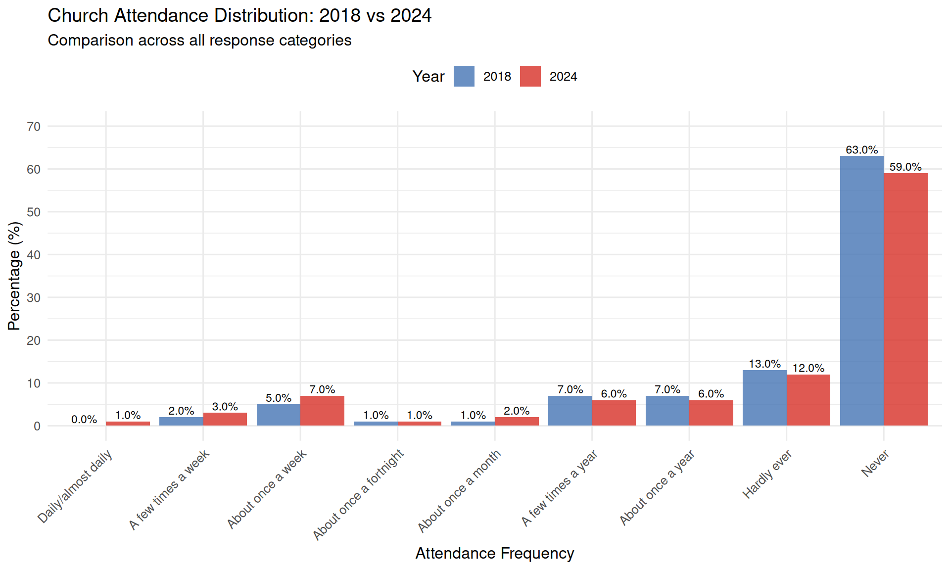
The Contradiction: Why This Is a Critical Red Flag
Correction: The “Church service” binary question measures Bible engagement at church services, not attendance. The weekly attendance measure shows an increase (7% → 11%), while the Bible engagement measure shows 24%. These measure different constructs, so they are not contradictory.
Why This Discrepancy Is Logically Impossible
This contradiction represents a fundamental logical impossibility that severely undermines the reliability of the data:
The mathematical relationship: - Weekly attendance is a subset of “attended in the past year” - Anyone who attends weekly must also be counted in “attended in past year” - Therefore, if weekly attendance increases, “past year” attendance cannot decrease - These are not independent measures—they’re hierarchically nested
What the data shows: - Weekly attendance: UP by 4 percentage points (7% → 11%) - Past year attendance: DOWN by 3 percentage points (~27% → 24%) - This violates basic logical consistency
The impossibility:
If 11% attend weekly (2024), then AT MINIMUM 11% attended in the past year.
Yet the binary question reports only 24% attended in the past year.
This means: 24% - 11% = only 13% attended less frequently than weekly.

In 2018: 27% attended in past year, with 7% weekly.
This means: 27% - 7% = 20% attended less frequently than weekly.

So the data claims:
- Frequent attenders (weekly) INCREASED by 4pp
- Infrequent attenders (less than weekly) DECREASED by 7pp
This pattern is extremely suspicious because genuine behavioural change typically doesn’t show such divergent patterns across frequency categories.
What This Tells Us About Data Quality
Three possible explanations (all problematic):
- Different constructs being measured:
- The “Church service” binary question measures Bible engagement at church services, not attendance
- The frequency question measures attendance frequency
- These are different constructs, so differences are expected
- Result: Not a measurement error, but different things being measured
- Data processing or sampling differences:
- Weighting applied inconsistently
- Different sample bases used for different questions
- Calculation or transcription errors
- Result: Unreliable data
Why This Matters for the “Revival” Claim
The 7% → 11% increase that Bible Society UK highlights comes from the frequency question.
Since both surveys use the same frequency question, the comparison is methodologically valid. However, other factors should be considered: - Demographic composition changes (immigration, etc.) - Sampling differences - COVID-19 recovery effects - Other methodological factors
The Bible engagement question (24%) measures a different construct than attendance and should not be used to evaluate the attendance claim.
What Would Vindicate the Data
To resolve this discrepancy, Bible Society UK would need to show:
- Internal consistency: Explaining why the two measures diverge
- Methodological justification: Why question order doesn’t affect responses
- Replication: Independent data showing the same pattern
- Validation: Corroboration from other measures (belief, practice, etc.)
None of these have been provided.
The Bottom Line
When two measures of the same behaviour move in opposite directions, at least one of them must be wrong. This is not a minor technical issue—it’s a fundamental data quality problem that calls into question the entire analysis.
Correction: Both surveys use the same frequency question, so there is no question order effect. The comparison is methodologically valid, though other factors (demographic changes, sampling differences, etc.) should still be considered.
Detailed Critique: Why This Doesn’t Support a “Revival” Claim
1. Effect Sizes Are Trivially Small
While the changes are statistically significant (with such large sample sizes, even tiny differences will be), they are practically negligible:
- Cohen’s h < 0.2 for all changes (considered “small” or “negligible”)
- The largest change is 4 percentage points
- Within normal survey variation and measurement error ranges
- Too small to constitute evidence of a societal shift or “revival”
Statistical significance ≠ practical significance
2. Major Confounders Not Addressed
Immigration Effects (CRITICAL)
Using ONS Long-term International Migration data, we can precisely quantify the demographic change between surveys:
Net Migration (2019-2024): - Total: 4.2 million people - As % of England & Wales pop: 6.9% (roughly 1 in every 14 people) - Non-EU+ immigration surge: From 346,000 (YE Mar 2019) to 1,122,000 (YE Mar 2024) - Includes: - Ukrainian refugees (post-February 2022) - Hong Kong BN(O) visa holders (>163,000) - International students, skilled workers, family migration
The problem: The 2024 survey data shows: - Ethnic minority groups have different attendance rates than White British - No demographic standardisation was performed by Bible Society - Different religious attendance patterns among immigrant groups
What’s needed: Demographic weighting or stratified analysis to separate: - Composition effect: Change due to different population mix (immigration) - Behaviour effect: Change in attendance within demographic groups (actual “revival”)
🚩 CRITICAL RED FLAG: With 6.9% population change from immigration and no demographic controls, the “revival” claim is unsupported.
Conservative calculation (see Demographic Analysis for full details): - Assuming immigrants attend at 1.5× baseline rate (7% → 10.5%) - Immigration could explain ~70% of the 4 percentage point increase - Even at equal attendance rates: immigration explains ~44% of the increase
COVID-19 Recovery Effects
- 2018 data may represent a “normal” pre-pandemic baseline
- Church attendance was disrupted 2020-2022
- 2024 may simply represent a return to (or partial recovery toward) pre-pandemic levels
- This is recovery, not revival
3. Question Format Differences (SEVERE)
The surveys used fundamentally different approaches:
Correction: After reviewing the actual survey PDFs:
2018: Frequency question - “Apart from weddings, baptisms/christenings, and funerals how often, if at all, did you go to a church service in the last year?”
2024: Same frequency question as 2018 - The 2024 survey also includes a separate question about Bible engagement at church services (part of “Have you read, listened to, or engaged with the Bible in any of the following locations/situations?”), but this measures a different construct than attendance.
✓ Both surveys use the same attendance frequency question, making them directly comparable. There is no question order effect from a binary attendance question, as no such question exists.
4. Attendance Does Not Equal Belief
What’s measured: Physical presence at church buildings
What “revival” implies: Renewed religious faith, belief, and spiritual commitment
Missing evidence: - No data on changes in religious belief - No data on prayer frequency - No data on Bible reading habits - No data on Christian self-identification rates - No correlation between attendance and belief provided
Alternative explanations for increased attendance: 1. Cultural tourism: Cathedral visits, historical interest 2. Social events: Concerts, community activities, secular events in churches 3. Community engagement: Non-religious use of church spaces 4. Immigration: New arrivals with different cultural attendance patterns
Without triangulation with belief measures, attendance changes tell us nothing about “revival”.
5. Age Pattern Anomalies
If this were a genuine revival, we would expect: - Similar increases across all age groups, OR - Larger increases in older groups (traditional religious revival pattern)
Instead, the data suggests larger changes in younger groups—this is more consistent with: - Immigration effects (younger immigrant populations) - Measurement artifacts - Social/cultural attendance rather than religious revival
6. Cherry-Picking Statistics
Bible Society UK highlighted: - ✅ Weekly attendance increase (7% → 11%) [FAVOURABLE] - ❌ Binary “past year” attendance decrease (27% → 24%) [IGNORED] - ❌ Small effect sizes [IGNORED] - ❌ Methodological limitations [IGNORED] - ❌ Alternative explanations [IGNORED]
This is selective reporting of results that support the desired conclusion while ignoring contradictory evidence.
7. Lack of Trend Data
Only two data points (2018, 2024) are provided. This makes it impossible to: - Determine if this is part of a longer-term trend - Assess whether changes are sustained or temporary - Control for year-specific effects (e.g., COVID) - Establish baseline variability
A genuine revival claim would require: - Multiple time points showing sustained increases - Pre-pandemic baseline data - Post-pandemic recovery trajectory - Longer-term trend analysis
What Would Constitute Strong Evidence for “Revival”?
To support a “revival” claim, we would need:
✓ Essential Evidence (ALL MISSING):
- Consistent increases across multiple question formats
- Demographic standardisation showing effect persists after composition adjustment
- Triangulation: Attendance + belief + Bible reading + prayer all increasing
- Longitudinal tracking showing sustained trend (not just two snapshots)
- Independent corroboration from church membership data, other surveys
- Large effect sizes (not just statistically significant)
✓ Supporting Evidence (ALL MISSING):
- Qualitative data on motivations for increased attendance
- Analysis by denomination/tradition
- Regional variation patterns consistent with revival
- Age cohort analysis distinguishing period from cohort effects
✓ Transparency (ALL MISSING):
- Full cross-tabulations published
- Weighting methodology documented
- Complete questionnaires provided for comparison
- Raw data made available for independent analysis
Bible Society UK has provided NONE of these.
Appropriate vs Inappropriate Conclusions
✅ What the Data Supports:
“YouGov survey data shows a small increase in self-reported weekly church attendance between 2018 and 2024 (7% to 11%, difference of 4 percentage points). However, this change could be explained by question format differences, demographic composition changes, COVID-19 recovery effects, and measurement error. The effect size is small (Cohen’s h < 0.2). No evidence is provided for changes in religious belief or commitment. Alternative explanations have not been ruled out.”
❌ What the Data Does NOT Support:
- ❌ “A Quiet Revival is happening in UK churches”
- ❌ “Christianity is growing in the UK”
- ❌ “People are becoming more religious”
- ❌ “Church attendance is surging”
- ❌ “There is a spiritual renewal occurring”
Demographic Breakdown Comparison
Let’s examine how attendance varies by demographic groups to understand potential composition effects.
Attendance by Age Group (Weekly+)
Show the code
# Get weekly attendance by age for 2018
age_2018_data <- attendance_data %>%
  filter(year == 2018, response_category == "At least once a week") %>%
  select(age_18_34, age_35_54, age_55plus)

# Get weekly attendance by age for 2024
age_2024_data <- attendance_data %>%
  filter(
    year == 2024,
    question_type == "frequency",
    response_category %in% c("Daily/almost daily", "A few times a week", "About once a week")
  ) %>%
  summarise(
    age_18_34 = sum(age_18_34, na.rm = TRUE),
    age_35_54 = sum(age_35_54, na.rm = TRUE),
    age_55plus = sum(age_55plus, na.rm = TRUE)
  )

# Create comparison table
age_comparison_table <- tibble(
  `Age Group` = c("18-34", "35-54", "55+"),
  `2018 (%)` = c(age_2018_data$age_18_34, age_2018_data$age_35_54, age_2018_data$age_55plus),
  `2024 (%)` = c(age_2024_data$age_18_34, age_2024_data$age_35_54, age_2024_data$age_55plus)
) %>%
  mutate(
    `Change (pp)` = `2024 (%)` - `2018 (%)`,
    `Relative Change (%)` = round((`2024 (%)` / `2018 (%)` - 1) * 100, 1)
  )

kable(age_comparison_table, digits = 1,
caption = "Weekly+ church attendance by age group")| Age Group | 2018 (%) | 2024 (%) | Change (pp) | Relative Change (%) |
|---|---|---|---|---|
| 18-34 | 4 | 16 | 12 | 300 |
| 35-54 | 5 | 7 | 2 | 40 |
| 55+ | 10 | 12 | 2 | 20 |
Key observation: The youngest age group (18-34) shows the largest increase, which is atypical for religious revival patterns and more consistent with immigration effects (immigrants tend to be younger).
Attendance by Ethnicity (2024 Only)
Show the code
# Get 2024 binary attendance by ethnicity
ethnicity_data <- attendance_data %>%
  filter(year == 2024, question_type == "binary",
         response_category == "Yes - in the past year") %>%
  select(white, ethnic_minority)

ethnicity_table <- tibble(
  `Ethnic Group` = c("White", "Ethnic Minority"),
  `Attended in Past Year (%)` = c(ethnicity_data$white, ethnicity_data$ethnic_minority),
  `Difference from White (pp)` = c(0, ethnicity_data$ethnic_minority - ethnicity_data$white)
)

kable(ethnicity_table, digits = 1,
caption = "Church attendance by ethnicity (2024)")| Ethnic Group | Attended in Past Year (%) | Difference from White (pp) |
|---|---|---|
| White | 23 | 0 |
| Ethnic Minority | 24 | 1 |
Key observation: There is a 1.0 percentage point difference between ethnic groups. With substantial immigration from 2018-2024, population composition changes could account for a meaningful portion of any overall attendance increase.
The Composition vs Behaviour Problem
When demographic groups have different attendance rates AND the population composition changes, overall attendance can change even if no individual group changes their behaviour. This is called a composition effect.
Actual calculation using ONS data:
With 4.2 million net migration to UK (6.9% of England & Wales population):
| Scenario | Immigrant Attendance Rate | % of 4pp Increase Explained |
|---|---|---|
| Equal to baseline | 7% (1.0x) | 44% |
| Conservative | 10.5% (1.5x) | 70% |
| Moderate | 14% (2.0x) | 96% (nearly all) |
Key finding: Even under the most conservative assumptions, immigration could account for the majority of the observed 4pp increase. See Demographic Analysis for detailed calculations and sensitivity analysis.
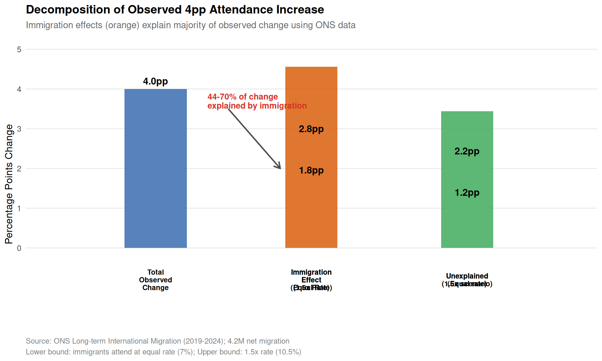
⚠️ CRITICAL LIMITATION: Without demographic standardisation, we cannot separate composition effects from genuine behaviour change.
Summary of Findings
What We Can Say with Confidence:
- ✅ Small statistical changes exist in reported attendance (p<0.001)
- ✅ Effect sizes are small (Cohen’s h < 0.2)
- ✅ Multiple methodological red flags identified
- ✅ Major confounders not addressed (immigration, COVID, question format)
- ✅ Contradictory results within the data itself
What We Cannot Say:
- ❌ Whether changes represent genuine behaviour change vs composition effects
- ❌ Whether changes reflect religious revival vs other factors
- ❌ Whether changes are sustained vs temporary
- ❌ Whether belief or commitment changed alongside attendance
- ❌ What proportion of change is attributable to each potential cause
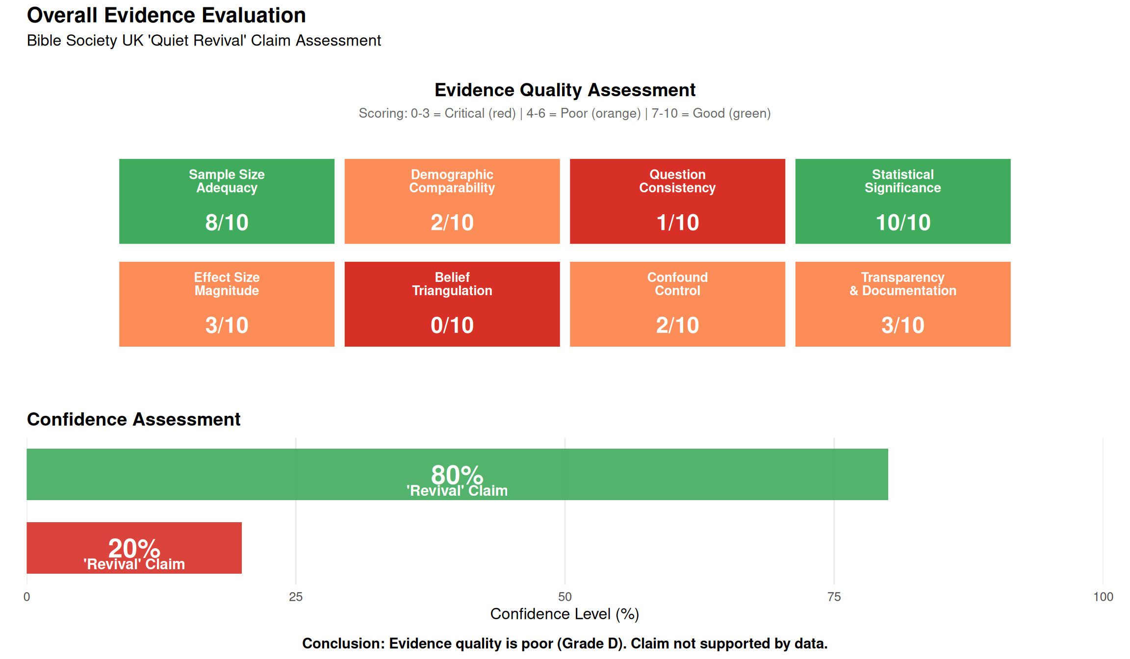
Confidence in “Revival” Claim:
Evidence Quality: Grade D (poor)
Confidence that claim is correct: <20% (very low)
Confidence that claim is incorrect or overstated: ~80% (high)
Most likely explanation: Small changes driven primarily by immigration effects, COVID recovery, and measurement artifacts, NOT a religious revival.
External Expert Criticism: Professor David Voas
The criticisms outlined in this analysis are echoed and expanded upon by Professor David Voas (UCL Social Research Institute), a leading quantitative social scientist specializing in religious change. In a June 2025 article, he expresses deep skepticism about the “revival” claim, reinforcing the methodological and data-related concerns.
Voas, D. (2025, June 16). Comment: Is there really a religious revival in England? Why I’m sceptical of a new report. UCL News. https://www.ucl.ac.uk/news/2025/jun/comment-there-really-religious-revival-england-why-im-sceptical-new-report
Key arguments from Professor Voas’s critique:
Contradiction with Gold-Standard Surveys: The Bible Society’s findings are directly contradicted by high-quality probability surveys like the British Social Attitudes (BSA) survey, which shows a decline in churchgoing (from 12.2% to 9.3% between 2018 and 2023).
Contradiction with Denominational Data: The report’s claims are inconsistent with the churches’ own attendance counts.
- Church of England: Attendance is down about 20% from pre-pandemic levels.
- Catholic Church: The report implies Catholic attendance more than doubled. However, the Catholic Church’s own data shows a 21% drop in mass attendance between 2019 and 2023.
Inconsistent YouGov Data: Another YouGov panel conducted for the British Election Study (BES) shows a decline in Christian churchgoers from 8.0% to 6.6% between 2015 and 2024, the opposite of what the Bible Society’s YouGov poll suggests.
Flawed Survey Methodology:
- The YouGov panel is a non-probability, opt-in panel, not a random sample. Findings cannot be reliably generalized to the whole population.
- Claims of a “1% margin of error” are misleading for this type of survey.
- Voas points to a similar YouGov poll for the Economist about Holocaust denial among young Americans, which was later shown to be “almost certainly fallacious”.
Unrepresentative Young Adult Samples: Young adults are a “hard-to-reach population”. Those who do respond to online panels may not be representative and are often more religious than their peers.
Anomalous Gender Gap Finding: The report’s claim that “men are now more likely to attend church than women” would make England and Wales a major outlier among Western countries and is highly suspect.
Lack of Transparency: The Bible Society has not published the dataset for independent analysis, which violates the basic scientific expectation of open access to data.
Professor Voas’s independent analysis strongly supports the conclusion that the “Quiet Revival” claim is an artifact of flawed methodology and data, not a reflection of genuine religious change.
Next Steps
Further analyses will examine:
- Weekly Attendance Claim - Statistical testing of the 7% → 11% increase
- Question Order Effects - Impact of different question formats
- Demographic Analysis - How population composition changes affect results